What a second colour changes in the block
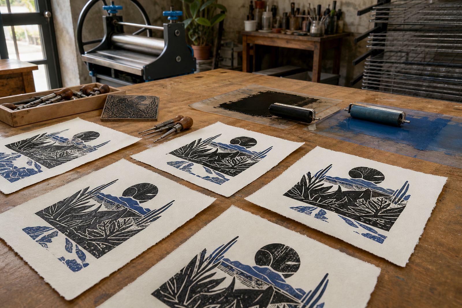
The first block usually teaches the image. The second block tests the plan. Once you split a design into two layers, you have to decide where each colour lives, where it overlaps and where it should stay open. In lino and soft-cut blocks, that means carving with the final join in mind.
For hand-printed work, the second colour adds depth and structure. It can pull the eye toward a face, a window, a garment edge or a shadow shape. In a workshop, people often notice that the print starts to feel less like a sketch and more like a finished edition once that second layer goes on.
Registration marks are small but they carry the job
Clean registration is the part most people underestimate. A few millimetres off, and a border starts to wobble or a face edge grows a thin halo. Simple methods work well for workshops: corner stops on the board, light pencil marks, and a sheet position that stays consistent from print to print.
- Keep the paper size fixed for the full edition.
- Mark the top edge and one side edge clearly.
- Test the fit with plain paper before adding ink.
- Use the same pressure and placement on every pull.
In our Woodstock studio, people soon see that registration comes down to repeatable placement. That habit matters whether you are printing by hand with a baren or using a press for a cleaner transfer.
Colour order decides the mood of the sheet
With two colours, the sequence matters. A pale ground printed first can sit under a darker shape and keep the image open. A darker first layer can hold the structure while the second colour adds warmth, outline or a printed shadow. Water-based inks suit quick workshop sessions because they clean up easily, while oil-based block inks give a richer feel and longer working time.
The choice is also visual. A second colour can change the mood from flat to layered, from playful to formal, from poster-like to something closer to a small fine-art edition. That is why a teacher, student group or family session often gets livelier after the first proof. People start comparing colour order and asking what would happen if the blue went down first, or if the ochre sat on top.
Carving for overlap needs a steadier hand
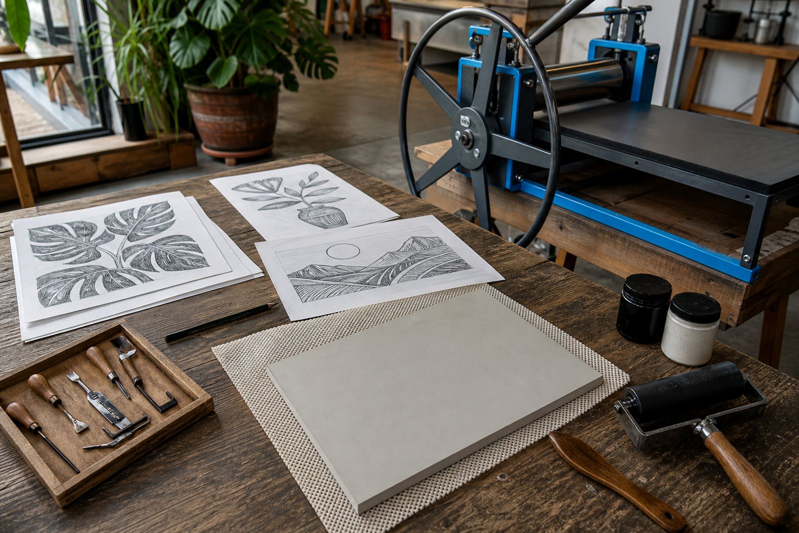
Two-colour work asks for cleaner carving than a single-block print. The raised areas must stay clear where you want overlap, and the cut lines need to stay readable once a second ink layer lands beside them. V-tools are useful for narrow channels, while wider gouges help open background spaces without tearing the block face.
Safe carving matters too. Good grip, a seated posture and controlled pressure keep the tools moving properly. Soft-cut blocks are useful for beginners because they cut easily, though they still need care around corners and thin bridges. Lino gives a firmer surface and holds a sharper edge, which suits more detailed editions. Either way, the second colour will expose rushed carving very quickly.
- Leave enough untouched surface for each colour to read clearly.
- Cut away any accidental ridges before printing the second layer.
- Keep the block face clean between pulls.
- Check that the dried layer will not smudge under the next pass.
A Cape Town workshop example from the table to the paper
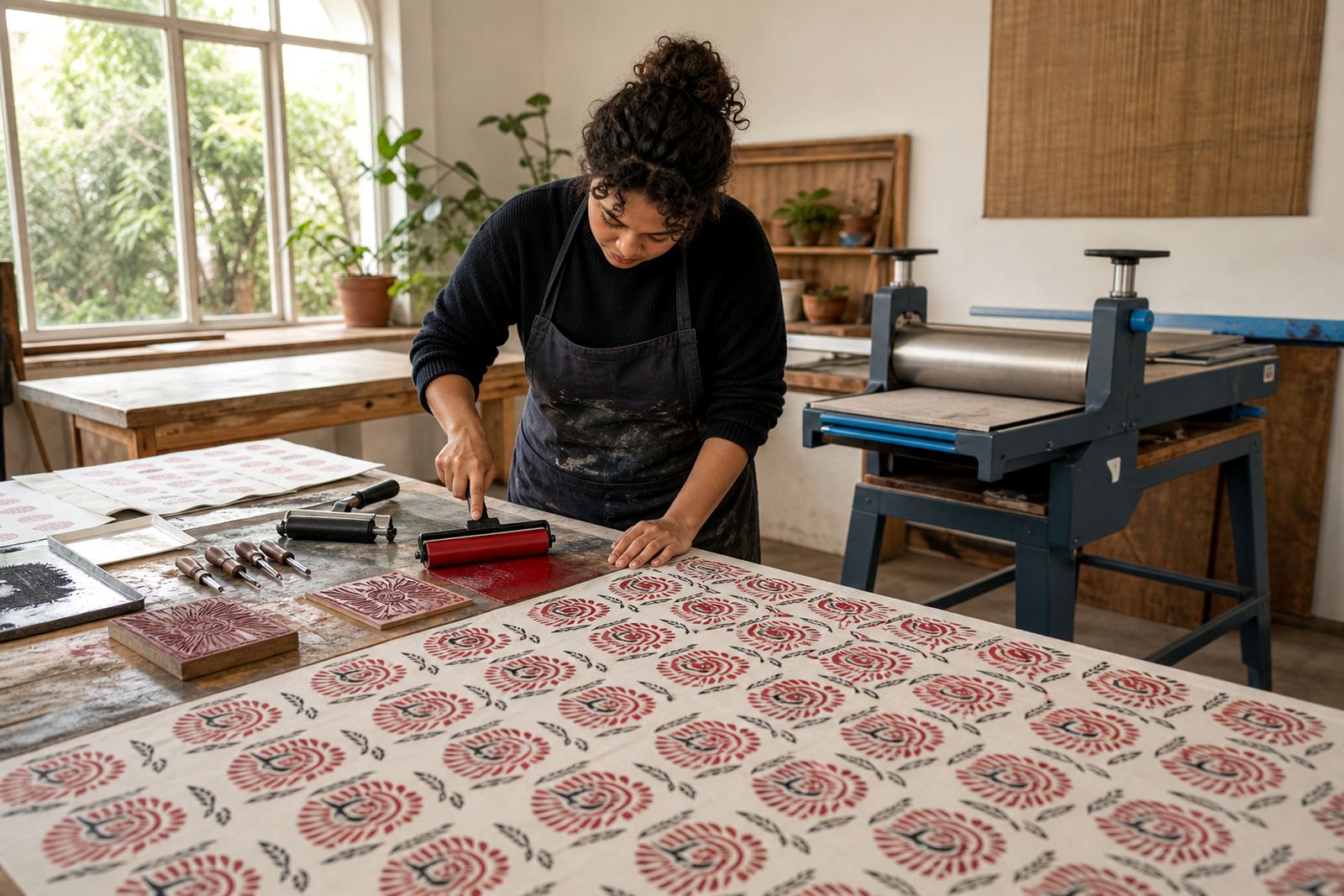
In a recent studio-style session in Woodstock, a small group built a simple two-block image of a street corner. The first block held the buildings and pavement shadows. The second block added window light and a stronger outline around the figures. Once the paper landed in the same position each time, the whole edition started to settle into place.
That kind of example works well in Cape Town because the city gives so many useful shapes to print from. A harbour crane, a line of flats in Bellville, a market table in Somerset West, or a campus view in Stellenbosch all lend themselves to layered colour. The image can stay simple. It only needs a clear split between what belongs to the first block and what must wait for the second.
Papers, pressure and the last pass through the press
Paper choice changes the feel of two-colour work. Softer papers take a hand burnish well and show the ink surface with more character. Smoother papers suit a press when the print needs even contact across both layers. If the first pass is too heavy, the second may sit awkwardly on top instead of joining the sheet.
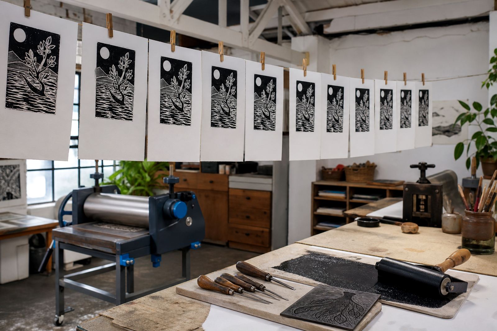
When printing by hand, the baren needs steady pressure and a consistent path across the image. A press can give a more even pull, especially for edition work with finer detail or a larger format. Either way, the second colour should be judged after the sheet dries, not while the ink is still glossy and uncertain.
- Choose paper weight that suits both layers of ink.
- Wait until each layer is dry, then print the next layer.
- Keep proofs nearby so the edition stays consistent.
- Check the edges of the image after the final pull.
What the second colour teaches students and teams
For adults, students, families and team groups, the second colour usually becomes the most useful lesson in the workshop. It shows how a print can be planned in stages. It also shows how small decisions, like a thinner line or a slightly shifted block, change the whole sheet. That is why two-colour printing often sparks better discussion than a single-colour image.
People leave with a clearer sense of editions, registration and ink handling. They also see that printmaking rewards patience without turning fussy. A clean two-colour print shows that the block was thought through, carved carefully and printed with enough control for both layers to sit together.