Shapes you can read from across the table
When someone sits down for a first print session, the best subject is usually the one with the fewest distractions. A mug, an aloe leaf, a fish, a Cape Town rooftop or a pair of hands can all work well if the shape is strong and the outlines are easy to follow. In lino and soft-cut block, the image needs to survive the cuts, so a busy scene with tiny windows, lace, hair strands and text often causes trouble before the first proof is pulled.
Think in terms of positive and negative space. The block will print what you leave behind, while the carved channels stay white or the colour of the paper. A simple first design helps you see that relationship early, which is useful when you are still learning how a gouge or V-tool moves through the surface.
- Choose one main subject, not a whole scene
- Keep outer edges bold and easy to trace
- Use large shapes that hold ink cleanly
- Avoid tiny details that need knife-like control
Draw for the block
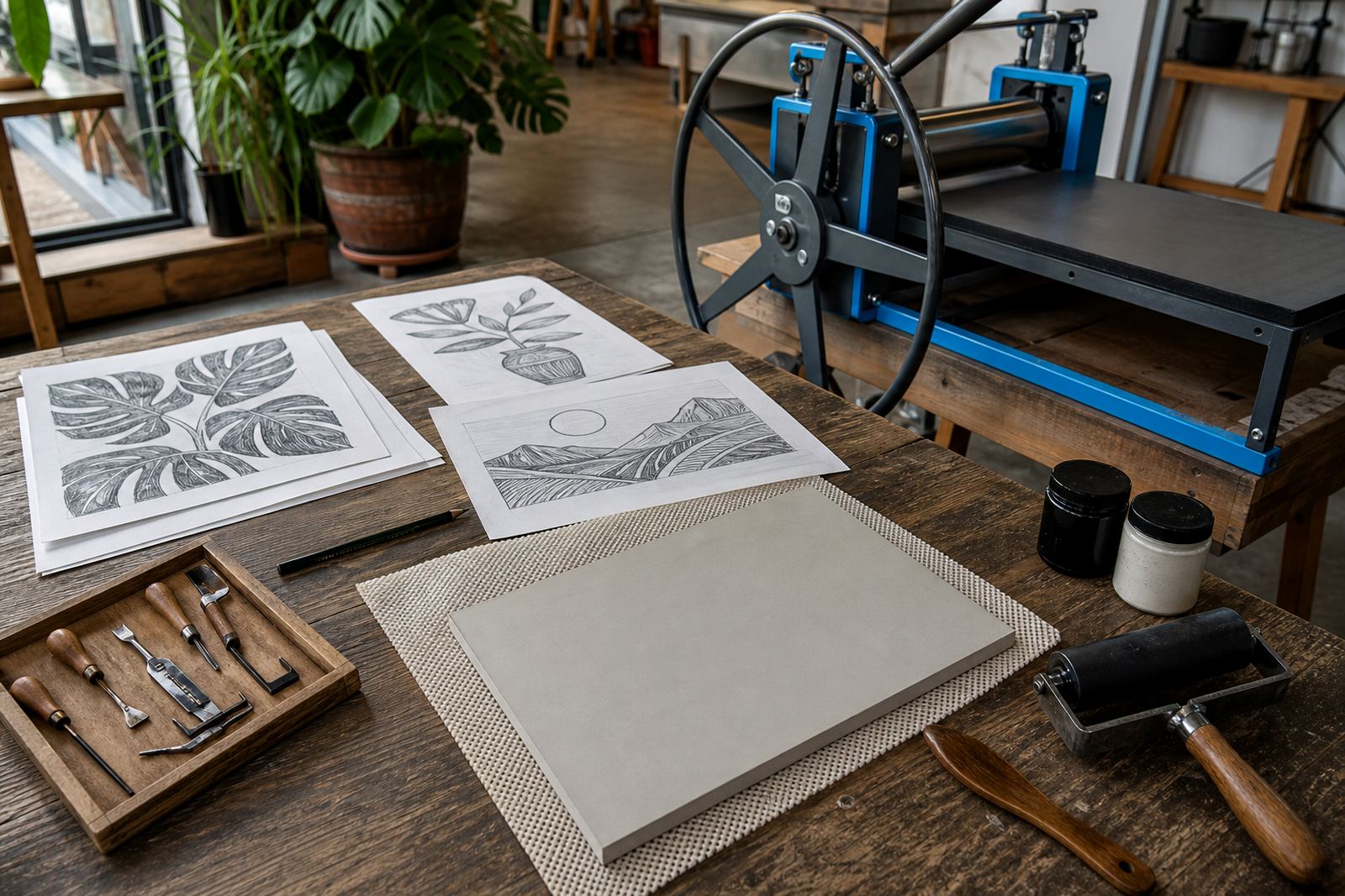
A sketch that looks lovely in a notebook may not behave on a printing block. Fine pencil shading, delicate texture and narrow gaps can disappear once the block is carved and inked. For a first design, it helps to redraw the image with thicker lines and simpler areas of tone. If you are making a portrait, for example, use a strong silhouette, a clear hairline and one or two feature marks rather than trying to capture every eyelash.
It also helps to remember that block printing reads differently when it is reversed. Any lettering, arrows or directional marks must be flipped before carving. A quick tracing onto thin paper or a light transfer onto the block lets you check the composition before the gouges touch the surface. That small step can reduce a lot of patching later.
- Reduce the number of details by half
- Flip lettering before you start carving
- Keep the composition balanced, not crowded
- Leave breathing room around the main image
Leave room for safe carving
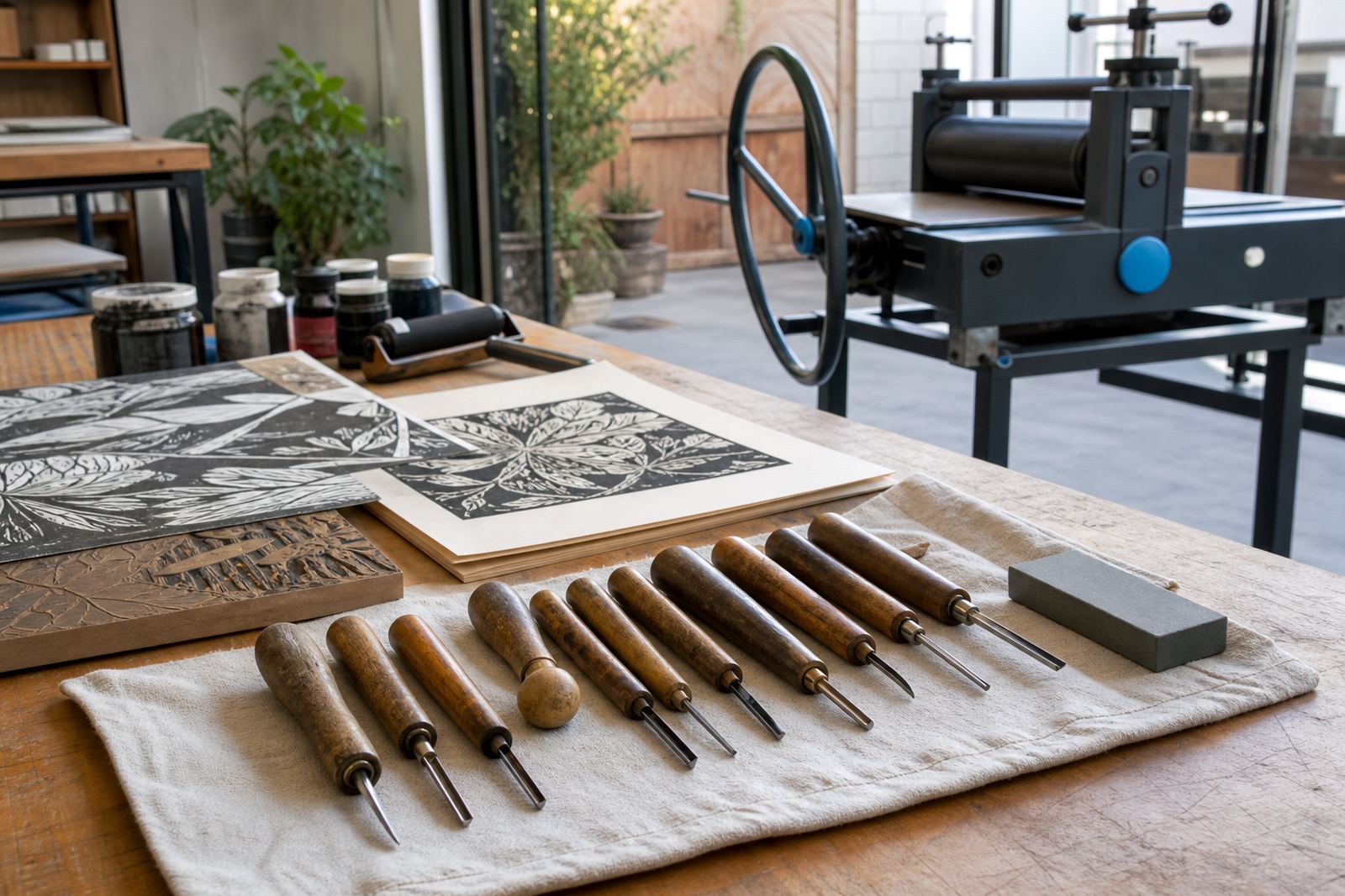
Safe carving depends on grip, direction and a steady block. The design itself should give your hands enough room to work. In a first session, narrow lines and sharp corners can push the blade into awkward turns, which is where slips happen. Soft-cut blocks are useful for beginners because they give a gentler cutting feel than harder surfaces, but the image still needs enough open space between marks.
At our Woodstock studio, we often see first-time printers do better once they widen the gaps between carved areas. A block with generous curves and steady lines is easier to clear cleanly with a V-tool, and it prints more evenly when the brayer rolls across it. That matters in a group session too, because the same image has to work for many hands.
- Keep fingers clear of the cutting path
- Use broad curves instead of tight corners
- Leave enough space for the gouge to turn
- Choose a block size that matches your comfort
Plan for ink, pressure and the first proof
A design that looks tidy in pencil may still fail if it cannot take ink well. Dense clusters of lines can fill in under a brayer, while very thin islands may not hold enough pressure for a clean print. Water-based block inks are useful for faster clean-up and shorter workshops, while oil-based inks can stay workable for longer and suit different papers and printing methods. The image should be strong enough to handle either one.
Keep in mind while drawing that the image will print in reverse. Baren printing and press printing both reward clear structure, and both need the carved areas to be open enough for the paper to meet the block properly. A first proof tells the truth very quickly, so a simple design gives you space to correct small issues without re-cutting the entire image.
- Make sure solid areas are truly solid
- Leave open channels where paper must sit flat
- Test the design with a proof before refining details
- Use paper that can take pressure without tearing
Registration in a small edition
If you plan to print more than one sheet, the design should support registration from the start. A clean border, a consistent corner mark or a simple guide line helps keep the paper in the same place for each pull. That is useful whether you are printing by hand in a studio or working through an edition in a school hall in Durban or a venue in Pretoria.
First-time printers often try to make the image too intricate because they want every print to feel different. Better to build a first edition around repeatable shapes and one strong focal point. That way the ink sits more evenly, the paper aligns more cleanly, and the finished set looks intentional rather than accidental. A steady design also helps during group workshops where several people are sharing one press or one set of tools.
- Mark the paper position before printing starts
- Use a border if the layout needs control
- Keep each pull similar in size and placement
- Let the design work for a small edition first
A Cape Town example
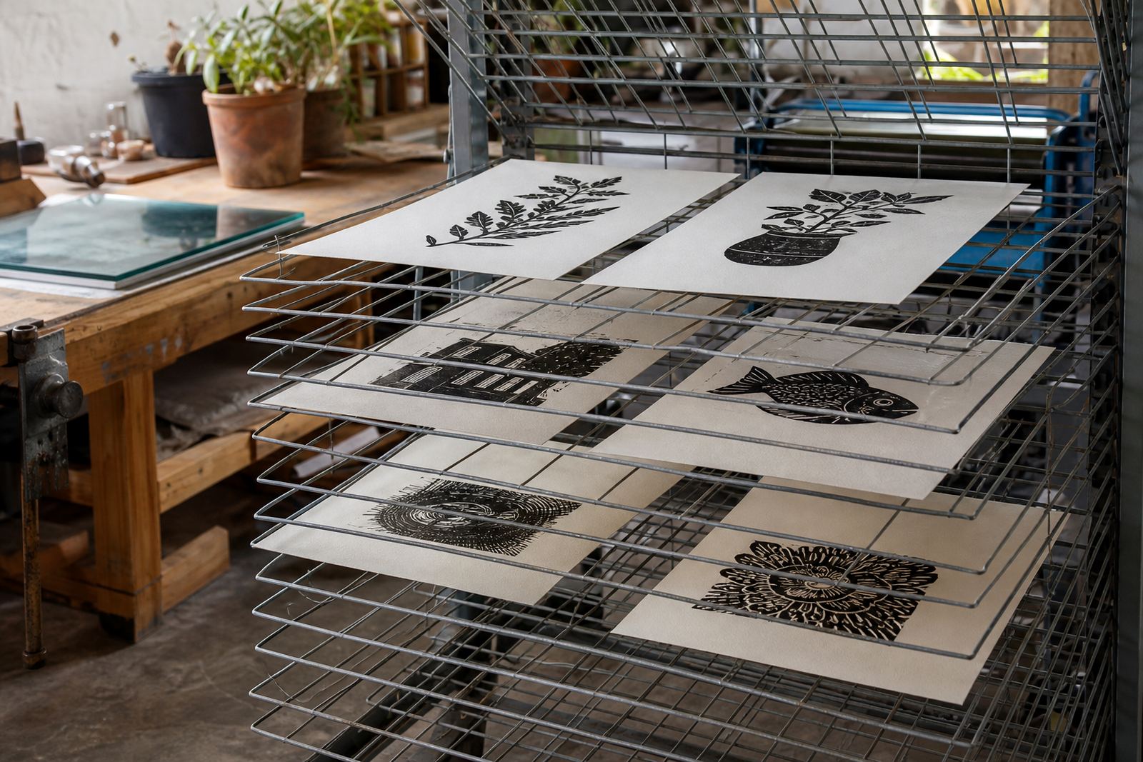
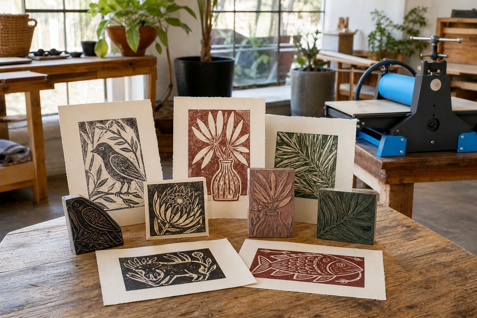
For a beginner session in Woodstock, a local plant shape often works better than a complicated street view. Think of an aloe leaf, a protea head or a simple seed pod with one bold outline and two or three interior cuts. The image feels recognisably South African without needing tiny detail, and it gives room to learn how to carve, roll ink and pull a clean print.
That kind of subject also works well for families, students and team groups because everyone can make a personal version without losing the basic structure. One person might cut broad leaf veins, another might add a single background texture, and a third might keep the block almost entirely silhouette. The result still reads as a shared workshop, but each print carries a different hand.
- Pick a local subject with a strong outline
- Keep the detail level manageable for beginners
- Allow each maker a small personal variation
- Choose an image that prints clearly in black or colour
A last check before carving
Before carving, step back and ask whether the image still works in one colour, one size and one clear mood. If the answer depends on small shading tricks or too many tiny parts, the design is probably too crowded for a first block. A strong beginner image should look good in pencil, survive the transfer, carve cleanly and print with confidence on the first proof.
That practical test is useful in a studio workshop, a school pop-up or a private session. It keeps the focus on making a print that can be finished well. When the subject is simple enough to cut cleanly, the ink and paper can do their work properly.