
Where the pale patches usually begin
Uneven areas often start before the paper touches the block. A lino block that still holds carving dust, an ink layer that sits too dry, or a sheet that has curled in humid air can all leave broken patches in the print.
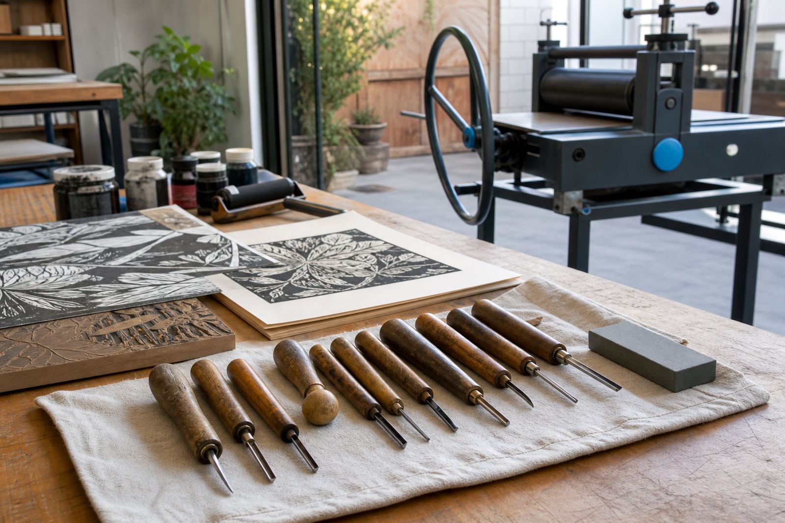
In workshops at our Woodstock studio, the first thing we look at is the surface of the block itself. Soft-cut material can show faint scuffs from a brayer, while harder lino may need a firmer hand on the press or a slower, steadier pull with a baren. If the design has open spaces and fine lines, those details can also read patchy when the ink is too thin or the paper is too absorbent.
Pressure changes that make a real difference
Pressure needs to suit the block, the paper and the method. Too light and the ink stays on the highest points only. Too hard and the image can blur, squeeze out from the edges, or pick up a second ghost of the design where it should stay sharp.
- Use even pressure across the whole block, right out to the edges.
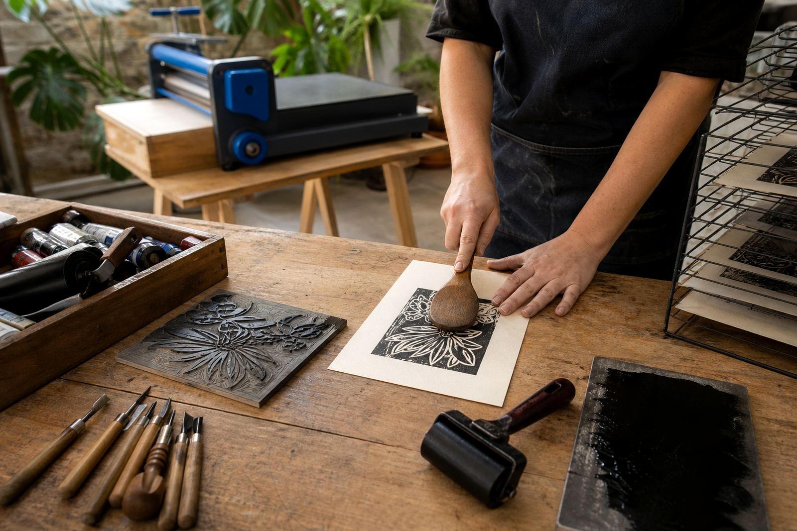
- With hand burnishing, work in overlapping strokes so no section is missed.
- On a press, check blanket or packing layers before changing the impression force.
- If one corner prints lighter, examine the block height and the paper placement.
For school groups and family sessions, we often show how the same block can print very differently with a slight shift in pressure. That lesson saves a lot of frustration later, especially when people move from a first proof to an edition of several sheets.
Paper choices that hold ink properly
People often blame the paper when the real problem is a poor match. A smooth sheet will take a clean line from a fine V-tool cut, while a heavier textured paper may need more pressure to reach into the cut marks. In Cape Town, coastal humidity can soften some papers quickly, so a sheet that looked flat in the morning may behave differently after a few hours in the studio.
Try this simple check: if the print looks pale in the shallow cuts but good on the raised ridges, the paper may be too stiff or the pressure too light. If the fibres start to fuzz or the edge of the image blurs, the paper may be too soft for the ink load. For edition printing, keep the same paper stock through the run so the tone and transfer stay consistent.
- Heavier paper usually suits deeper carved blocks.
- Light paper can show fine detail well, but tears more easily.
- Textured paper may need stronger burnishing than smooth sheet.
- Always test a proof before starting the full edition.
Ink that is too dry, too stiff, or too heavy
Block ink should sit evenly on the brayer and roll onto the block in a thin, consistent film. If the ink is stiff, it can sit in lumps and leave broken marks. If it is too wet or too heavy, it may flood the carved lines and kill the detail.
Water-based ink is often easier for beginner sessions because it cleans up simply and suits shorter workshops. Oil-based block ink can hold a richer surface and longer working time, though it needs a steadier hand and more careful clean-up. Neither type should be used in a thick layer. The goal is to coat the raised surface and leave the cut marks clean.
A practical test is the sound and feel of the brayer. If it sounds tacky and drags, the ink may need a tiny adjustment. If it rolls glossy and wet, there may be too much on the slab. The best proof usually lands with a quiet, even hand and no heavy shine.
Registration drift and the false patch problem
Sometimes a print looks patchy when the real issue is registration drift. If the paper shifts even a few millimetres between layers, the image can appear doubled, cropped or faded on one side. In a two-colour block print, that can read like a transfer failure when it is really a placement problem.
We see this often in team sessions where several people share a press. One person pulls the sheet a touch off square, then the next proof sits low on the block and the image seems lighter. A simple corner mark, stop guide or pinned layout can settle that problem quickly.
- Mark the paper and block before the first proof.
- Keep the sheet aligned to the same edge every time.
- Lift the paper straight up after printing, not from one corner first.
- Check whether the issue repeats in the same place on every sheet.
A Woodstock example from a mixed group session
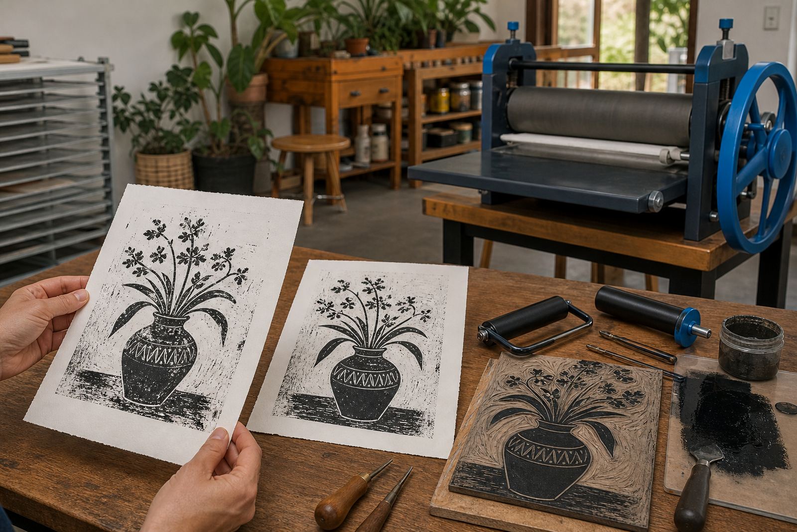
In our Woodstock studio, a mixed group once brought in a simple leaf design cut into soft-cut blocks. The first proof looked pale at the tips, while the centre print was strong. The cut lines were fine, but the pressure had been applied unevenly and the paper had started to curl from the room conditions.
We adjusted the brayer load, flattened the paper under clean boards, and slowed the burnishing so each section got the same pass. The next proof carried the leaf veins cleanly from edge to edge. The steadier sequence fixed the print.
That is the part people often miss. Patchy transfer usually has a practical cause that can be seen, tested and corrected. Once the pressure, paper and ink are working together, the print stops fighting itself and the edition starts to hold together properly.