Why one ink can teach more than three
A single colour forces the block to do the talking. You see how a carved line catches light, how a shallow cut prints a faint edge, and how a broad relief area holds ink without muddying the image. That is useful whether the block is lino or a softer carving sheet, because the hand learns the same habits either way.
With one colour, there is less to hide behind. A first-time printer has to work out what should print and what should stay white, then carry that decision through every cut. It is usually the clearest route into relief printing, especially for people who want to understand the method before adding layers of colour.
The block, the tool, the cut
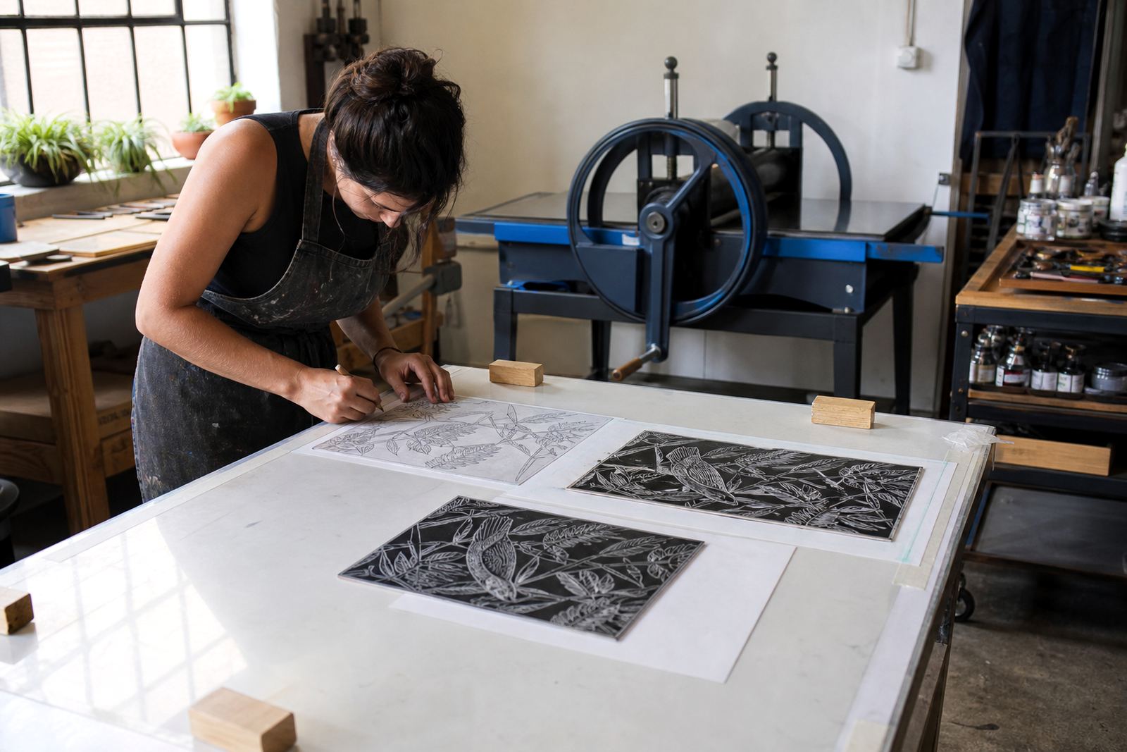
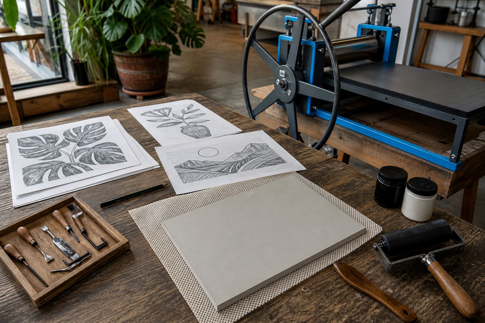
We begin with the block or paper and the right tools. A V-tool gives a crisp line, while gouges remove wider areas and make bold shapes. Soft-cut blocks are forgiving for quick studies, and lino rewards a firmer hand and cleaner planning. Safe carving matters at every stage, so the blade moves away from the body and the block sits steady on the table.
- Plan the image with simple light and dark areas.
- Mark the cut lines before any deep carving.
- Keep fingers behind the tool and the work flat.
- Test small marks before opening up larger spaces.
That sequence makes a one-colour project easier to control, and the finished print usually looks sharper because of it.
Inking without losing the drawing
Once the block is ready, the inking stage teaches pressure, coverage and restraint. A brayer should carry an even film of water-based or oil-based block ink, not a heavy paste that fills the fine cuts. Too much ink closes detail, while too little leaves patchy areas that read as accidents rather than choices.
One colour lets the printer focus on the shape of the image instead of juggling mixed inks. It also helps when learning how the paper takes the impression. Some papers need a softer touch and a shorter roll, while others hold up better under a firmer pull. Those differences become obvious very quickly in a single-colour edition.
Printing by hand, then checking the edition
A baren, spoon or press can all transfer a strong impression if the pressure is consistent. For a first edition, the real lesson is repeatability. The first print may be slightly different from the tenth, so the printer watches the margins, the ink load and the pressure on each pull.
- Set the paper in the same position each time.
- Use registration marks when the image needs alignment.
- Check the first print before you proceed with the full run.
- Keep the paper stack clean and dry on the studio table.
That discipline matters in a one-colour series because there is nowhere for a misplaced layer to disappear. Each sheet has to hold its own.
Where single-colour work helps groups settle in
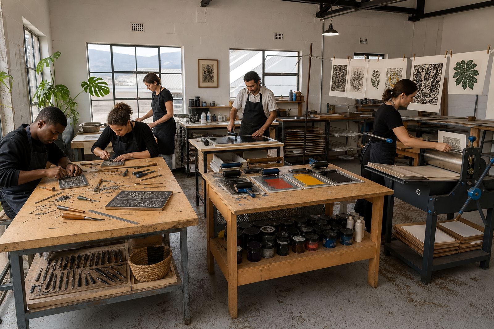
Families, school groups and team sessions often do best when the project stays clear and manageable. One colour keeps the pace steady while still covering carving, inking, printing and drying. People can finish a block, print a small edition and take home a result that shows the whole process from start to finish.
For a school pop-up in Cape Town, we might set a simple leaf, building or symbol theme so the block stays readable on the first pass. In Johannesburg or Pretoria, the same one-colour format works well in a venue session where tables, papers and ink stations need to be kept tidy. The method stays the same, only the room changes.
What the first print usually teaches best
The first print often shows the most. It tells you whether the carved whites are large enough, whether the ink is even, and whether the image needs a heavier line. That is why one-colour projects make sense for beginners and for people returning to the craft after a long break.
- Use the print to judge carving depth.
- Look for dry spots, filled cuts and weak edges.
- Adjust the block before printing the full edition.
- Keep notes on paper choice and ink handling.
Once those basics are clear, more complex projects usually feel less mysterious. A strong single-colour print builds habits that carry into layered work later on.
A Woodstock lesson that stays practical
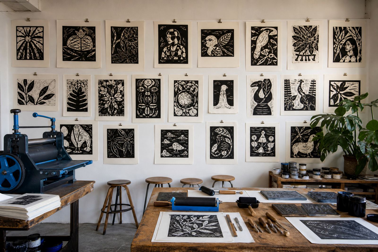
In our Woodstock studio, a one-colour class can move from first sketch to printed sheet without rushing the learning. Someone may carve a bold flower, another person a street scene or a pattern drawn from a local market stall, and both can print a clean edition on the same table. With one colour there are fewer moving parts, so people can read the whole process from block to sheet.
That is why single-colour work often remains useful even after the first workshop. It still teaches line, pressure, registration and editioning in a way that feels plain and direct. For many people that is the best place to begin.