Carving the room around the image
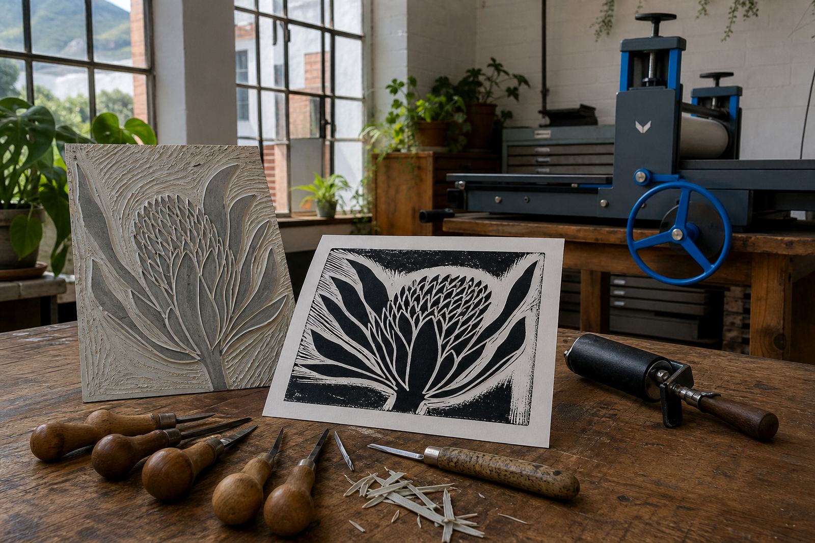
Most first-time carvers focus on the subject and forget the space around it. In block printing that surrounding area keeps the image readable. When you carve away the non-printing zones, the remaining raised surface becomes the mark-maker, so every cut changes the balance of the whole block.
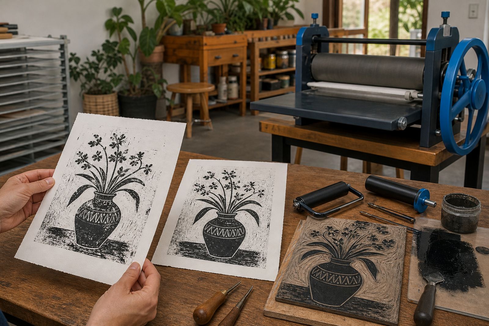
That is why a face, leaf, building or lettering study can shift so much between a crowded block and a clean one. A heavy outline may hold the subject in place, but the carved gaps decide whether the print feels tight, open or bright. In a workshop, this lesson usually lands fast once the first proof is pulled and the paper shows exactly where the block has spoken and where it has stayed quiet.
Uncarved space holds the picture together
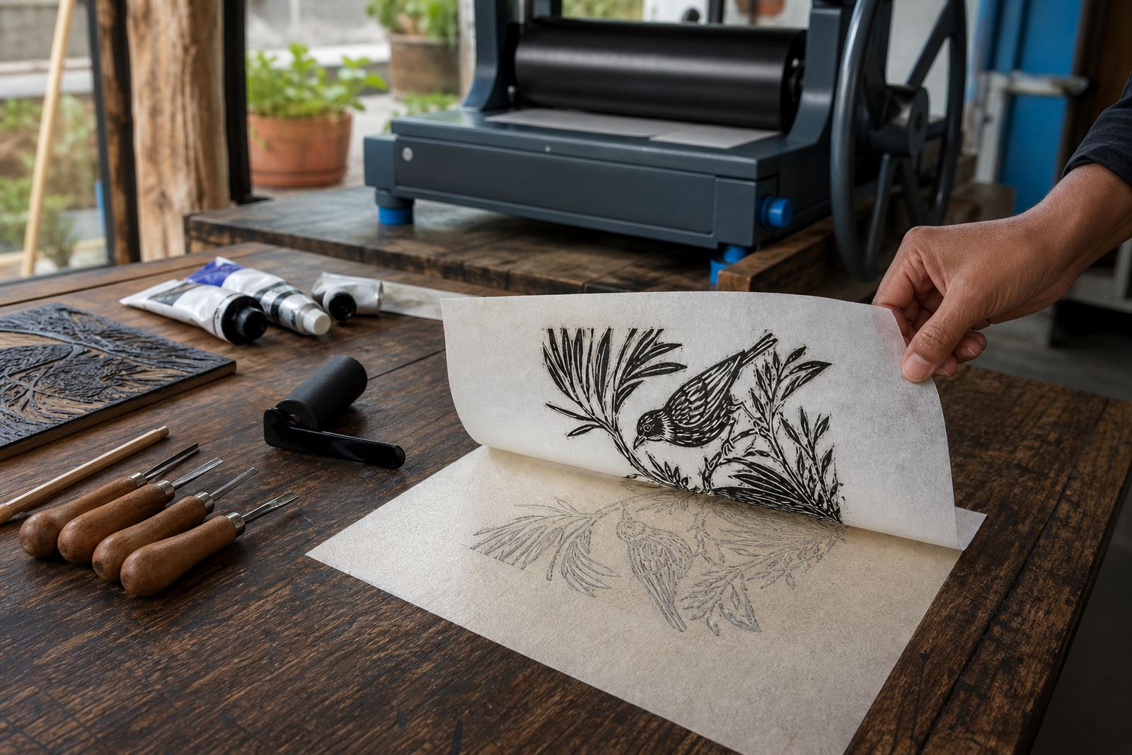
Negative space works like a frame inside the image. It separates one shape from another, gives breathing room to curves and stops the whole print from turning into a dark mass. Even a simple lino cut with one bird or one bottle shape can feel richer if the surrounding areas are cut with care, because the unprinted paper becomes part of the design.
On softer block materials, beginners often press too hard with gouges and lose control of these quieter areas. A shallow cut can soften a transition, while a deeper cut gives a stronger edge and a clearer contrast. We keep that conversation practical in the studio, because the right space is often the difference between a print that reads at arm’s length and one that still works up close.
- Use a pencil sketch to mark the main masses before carving.
- Leave enough paper showing so the subject can breathe.
- Carve the background in stages.
- Check the block under side light to see rough edges.
How the tools change the thinking
Linocut and soft-cut blocks ask for different decisions. A V-tool gives a fine furrow for hair, stems or lettering, while a wider gouge clears larger fields around the subject. If the block is meant for a bold poster-like print, the carved spaces can be wider and simpler. If the image depends on delicate pattern, the negative areas need more control and a steadier hand.
Brayers, barens and presses each reveal the same thing in a different way. Hand-rolled ink will pick up every slight ridge, and a press print can flatten the ink more evenly across the sheet. Water-based inks dry faster on the surface, while oil-based block inks often stay open longer and can carry a richer feel. In both cases, the carved space is what lets the ink sit clearly instead of spreading into confusion.
Edition thinking starts before the first pull
Once a block is carved, the edition depends on how consistently the printed and unprinted areas behave. Registration marks help each colour or layer sit where it should, and that matters when the white paper is part of the image rather than just the background. If the carved zones are muddy or uneven, each print in the edition can drift in appearance, even when the ink is mixed the same way.
A clean edition usually begins with a clear plan for what will stay raised and what will be removed. Some makers block in broad shapes first, then return to sharpen edges after a proof. Others use a second block for a separate colour and let the negative space on the first block do the heavy lifting. Carve less, and make each cut count.
- Keep one proof sheet aside as a reference for the edition.
- Watch how paper choice affects sharpness and contrast.
- Trim stray bumps that catch ink outside the intended shape.
- Leave a margin around the image so the block does not feel cramped.
A Woodstock workshop example
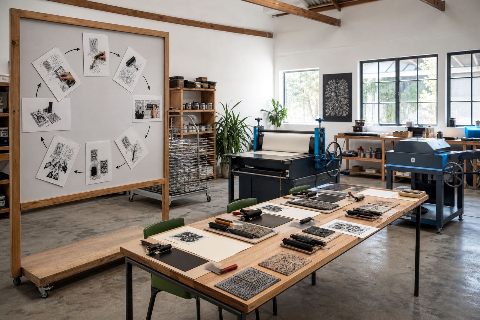
In Woodstock, Cape Town, this idea becomes obvious when a first-year design student and a family group work on the same brief. One person may draw a bold flower head and keep the background almost untouched, while another carves deep around the petals so the bloom sits like a bright cut-out on the sheet. Both can work, but the mood is different. The first feels open and airy, the second feels stronger and more graphic.
In our studio sessions, that contrast is often the turning point. A learner starts by carving every line they can see, then realises the strongest part of the print may be the paper left behind the image. That shift matters in Cape Town, and it matters just as much in a school pop-up in Durban or a team session in Pretoria, where the same block-print logic has to hold up across different hands and different speed of working.
Small habits that keep the image clean
Negative space thinking becomes concrete once the block is in your hand. It comes down to a few habits that keep the image sharp and the print legible. Safe carving also matters, because a steady grip and a clear cutting direction protect both the block and the hand working it. A slip in the wrong place can remove a useful edge and change the whole balance.
Useful habits include watching the block upside down, stepping back before the final cut and comparing the open areas against the main shapes. In a beginner carving session, that pause is often where the print improves most. The image stops being a drawing to fill in, and becomes a structure built from light, ink and the spaces left behind.
- Turn the block often so you do not overwork one side.
- Use test cuts on the edge before touching the main image.
- Keep the paper and block aligned before every pull.
- Let some areas stay quiet so the strongest marks can stand out.