Mix for the edition size
In a lino or soft-cut workshop, colour mixing works best when the print plan is clear before the brayer touches the slab. A single block can carry one colour, a layered blend, or a split fountain effect, but the mix must still behave the same way across the full edition. That matters when you are pulling six, eight or twenty prints and want each sheet to sit in the same visual family.
We usually begin by deciding whether the print needs strong coverage, a translucent stain, or a softer hand-printed feel. Water-based block inks tend to suit quick studio clean-up and lighter paper work, while oil-based inks give longer open time and a denser print on the sheet. In both cases, the colour should be mixed to the job. A warm red that looks bold on a palette knife can print flatter once it passes through the brayer and onto textured paper.
How to judge colour on the slab
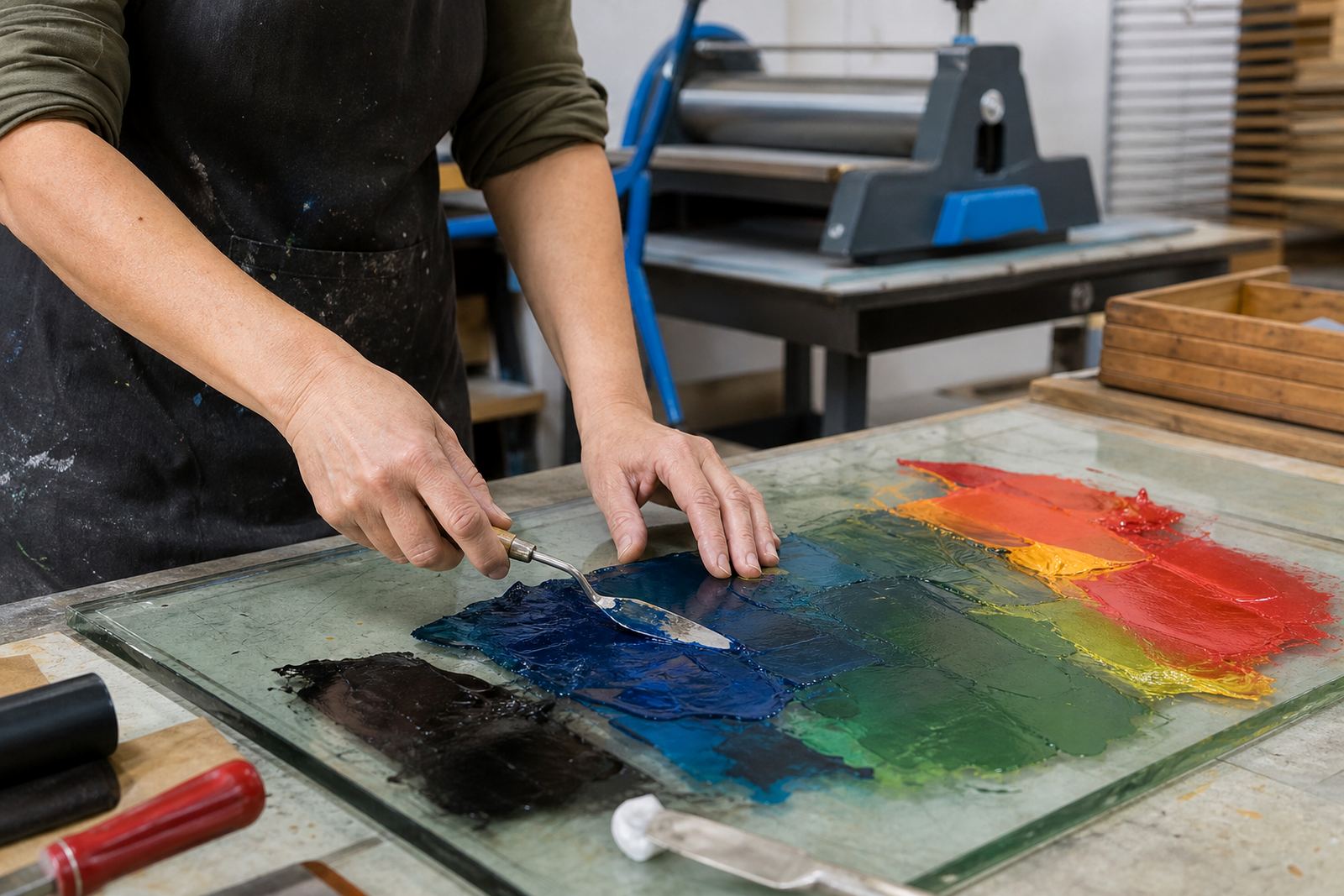
The slab shows the true colour. When the ink is spread with a brayer, the surface should look even, with a slight tack that lets the roller pick up a clean film. If it looks glossy and wet, it can flood the carved lines. If it looks dry and crumbly, the block may print patchy or resist the paper. That balance is part of the craft and it changes with room temperature, paper absorbency and how long the ink has been open.
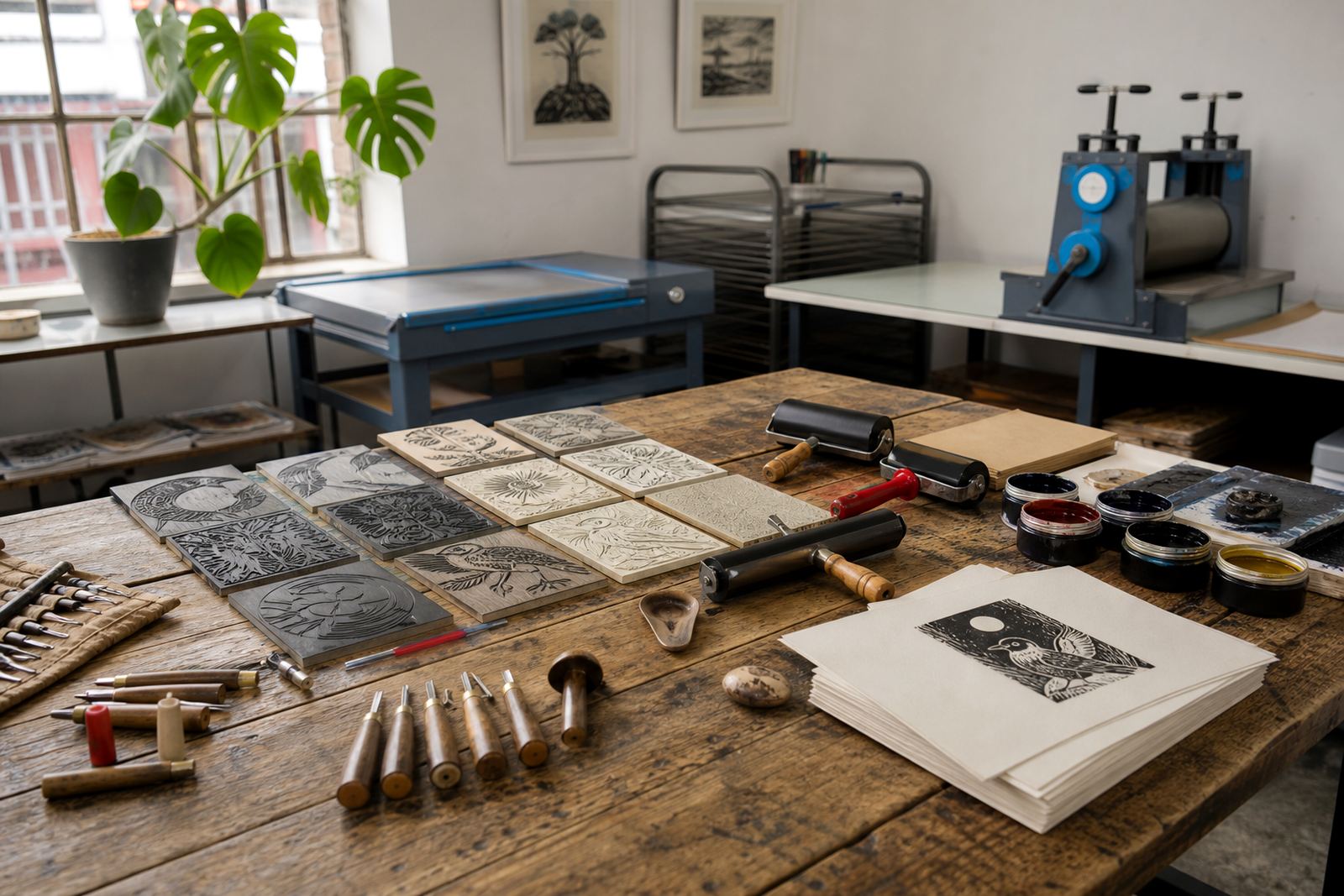
- Use a palette knife to mix a full, even colour before rolling.
- Test one small proof on the same paper you will use for the edition.
- Check the carved areas, because shallow cuts can pick up stray colour.
- Keep a note of the mix ratio so you can repeat it later.
- Wipe the slab edges before each new proof to avoid dirty tints.
In Cape Town, a breezy studio near Woodstock can dry water-based ink faster than expected, while a more enclosed room may keep the ink open for longer. That small shift changes how hard you need to roll and how quickly you should move from inking to printing.
When two colours meet on one block
Many beginners want a rainbow effect on the first attempt, but block printing rewards restraint. Two-colour work is often clearer when the block is carved with separate fields and printed in stages. One colour can sit in the open shapes, then a second pass can sharpen the image, add shadows or bring in a quieter background tone. The key is registration, because even a few millimetres off can make the image look blurred rather than intentional.
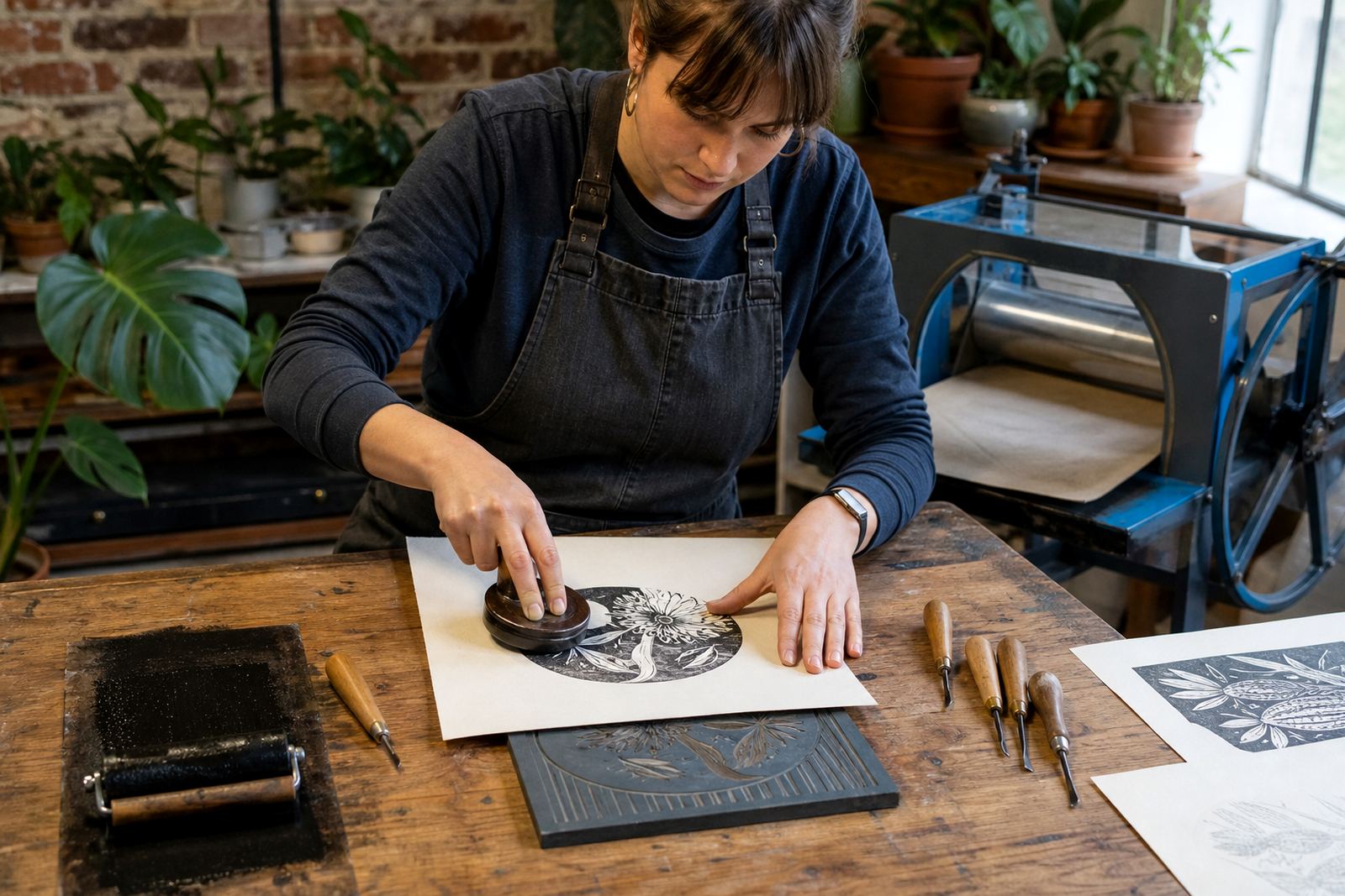
For hand printing, registration marks are usually simple and practical. A corner guide, a taped edge or a prepared registration board helps each sheet return to the same position. The paper must sit square, and the printmaker needs to lift and lower it without dragging the sheet across the inked block. Press printing gives firmer pressure, but a baren can still produce a crisp result if the colour layer is even and the paper is not too thick.
Paper, pressure and the way colour lands
Colour is never only about pigment. The paper makes a direct difference to how the colour appears, especially in linocut where carved lines can hold fine detail. Smooth paper usually shows sharper edges and brighter colour, while a softer sheet may pull more ink into the fibres and mute the tone a little. Handmade papers can be beautiful, but they need testing because the tooth of the surface changes how the brayered ink transfers.
- Heavier papers often suit press printing and repeated editions.
- Softer sheets can show more texture from the block and the baren.
- Bright white paper makes warm colours look cleaner.
- Cream or off-white paper can soften strong blues and reds.
- Textured papers may need more careful pressure on the second pass.
In a student class, this is one of the easiest lessons to see: the same ink mix can look sharp on a smooth sheet and far quieter on a textured one. That is the material speaking back.
Mixing for safe carving sessions and clean hands
Colour mixing starts before ink is opened, especially in workshops with families, schools or first-time printmakers. Safe carving with gouges and V-tools means the block surface has to stay readable, so the ink should not hide the cut lines while you are checking the design. Soft-cut blocks can take a lighter touch, and they often show colour more quickly because the surface is smoother and the cuts are shallower.
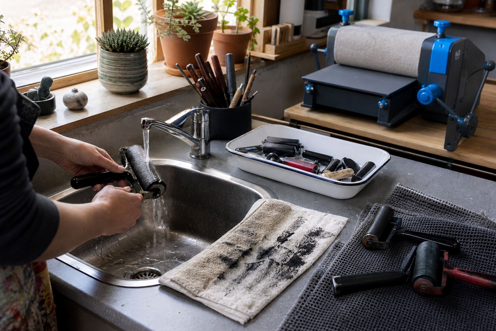
We keep a few habits in place during group sessions. Wipes and scraps stay near the slab, the brayers are loaded in small amounts, and students are shown how to remove excess ink before it reaches the raised areas of the block. That keeps the image crisp and helps avoid muddy edges. It also means each person can compare a first proof with the next pull and see exactly what changed.
- Mix one colour at a time when teaching beginners.
- Keep separate rollers for light and dark inks.
- Label test sheets so the sequence stays clear.
- Use scrap paper to judge tone before printing the edition.
- Clean tools before moving from water-based to oil-based ink.
A Woodstock print room habit that saves the edition
In a Woodstock studio, colour mixing often has to work under real workshop pressure, with a mix of adults, students and team groups at different stages of the process. A practical habit is to start every session with a proof sheet and keep that sheet beside the slab. When the edition grows, the proof becomes the reference for colour strength, pressure and registration. If the ink shifts too warm or too cool, the change can be corrected before the full stack is printed.
For a local example, imagine a Durban group using a two-block seaside motif with a deep blue foreground and a sandy ochre base. The first block needs a controlled, even tint so the second layer can sit on top without turning green or brown. That is where mixing discipline matters. The colour has to stay consistent through the rest of the run.
Teachers and group leaders often find that the cleanest results come from smaller mixes, repeated as needed. That keeps the ink fresh, avoids waste and makes it easier to adjust the tone when humidity, paper weight or pressure changes the print.
What makes a repeatable print feel hand-made
A repeatable edition can still look handmade. Hand-printed colour usually carries slight shifts, tiny edges and the grain of the block, and those details are part of the work. The trick is to keep the shifts controlled. A baren can give a softer finish, a press can flatten the colour more evenly, and a well-mixed ink can hold the image together across the whole edition. The print should feel made by hand, but not accidental.
That balance is what students usually remember after a session on colour. They see how a small change in water, binder, pressure or ink load changes the sheet. Then the block becomes a tool for a whole run. It becomes a tool for matching intention to paper, and that is where block-print colour starts to make sense.