Paper that takes ink without fighting back
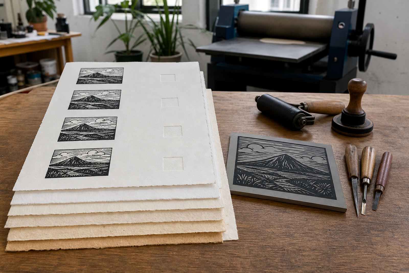
In hand-printed work, paper has to receive ink from the block and hold fine edges without buckling. Thin paper can show every shift in pressure, while heavier sheets can take a firmer pull and sit flatter after printing. The right choice depends on the block, the ink, and whether you want a soft, lively finish or a sharper, more formal edition.
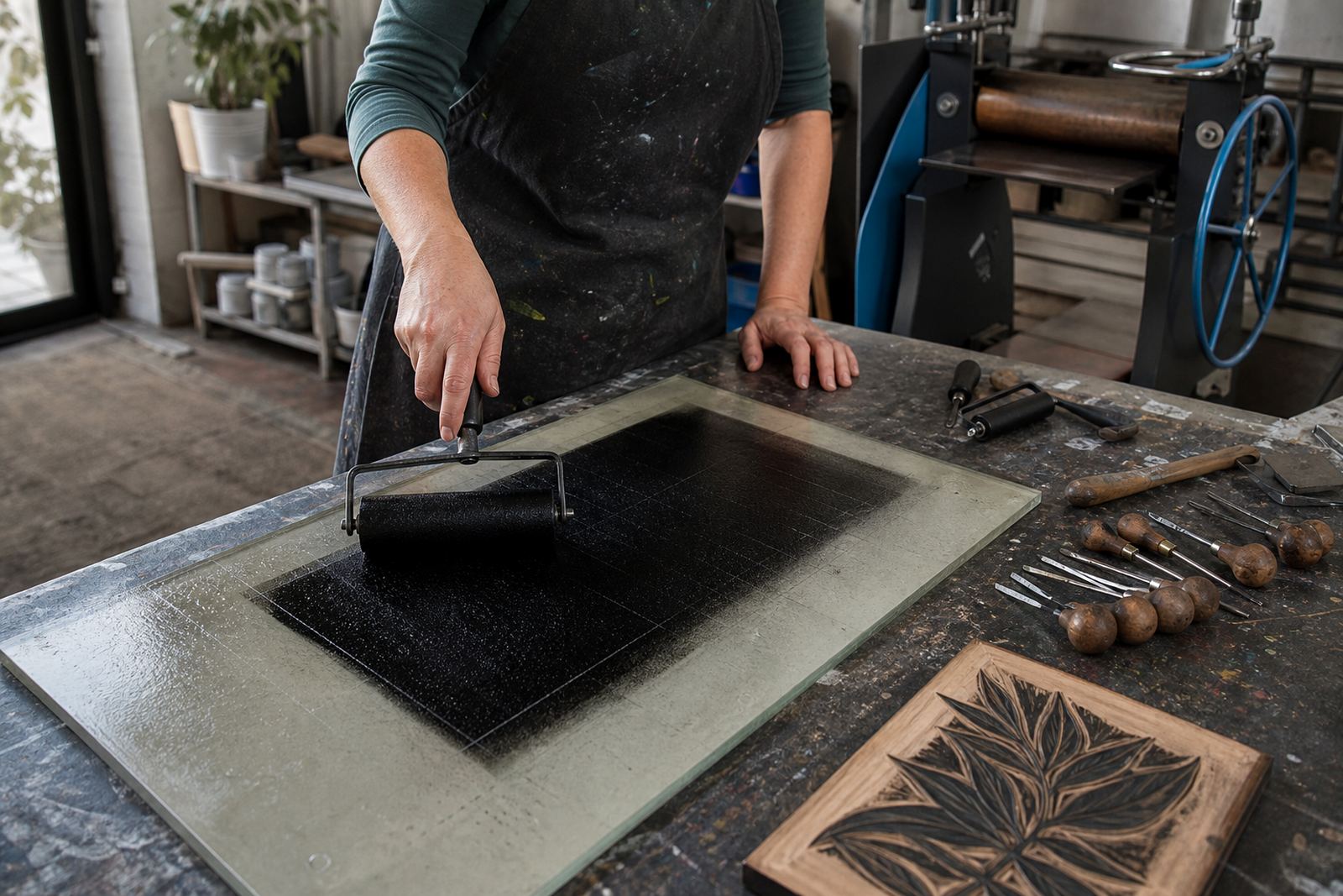
For lino and soft-cut blocks, the paper must cope with the small changes that happen when a brayer rolls ink across the block and a baren or press pushes it into the fibres. A sheet that is too light may crease under the hand, while a sheet that is too heavy can feel stubborn and may need more pressure than a beginner can manage safely.
How sheet weight changes the print on the page
Paper weight is usually measured in gsm, and surface, sizing and fibre also change how a sheet prints. A 160 gsm cotton-rich sheet can feel softer than a 200 gsm woodpulp sheet, and an uncoated paper may drink ink differently from a smoother stock.
- Lighter papers can show a delicate bite from the block and work well for small editions, but they need careful handling.
- Mid-weight papers often suit workshops because they balance strength with easy pressing by hand or on a small press.
- Heavier papers feel sturdy and can carry bold solid areas, though they may need more pressure to pick up detail cleanly.
- Textured sheets can add character, yet they may soften fine lines if the grain is too strong for the block.
Matching paper to the block, tool and ink
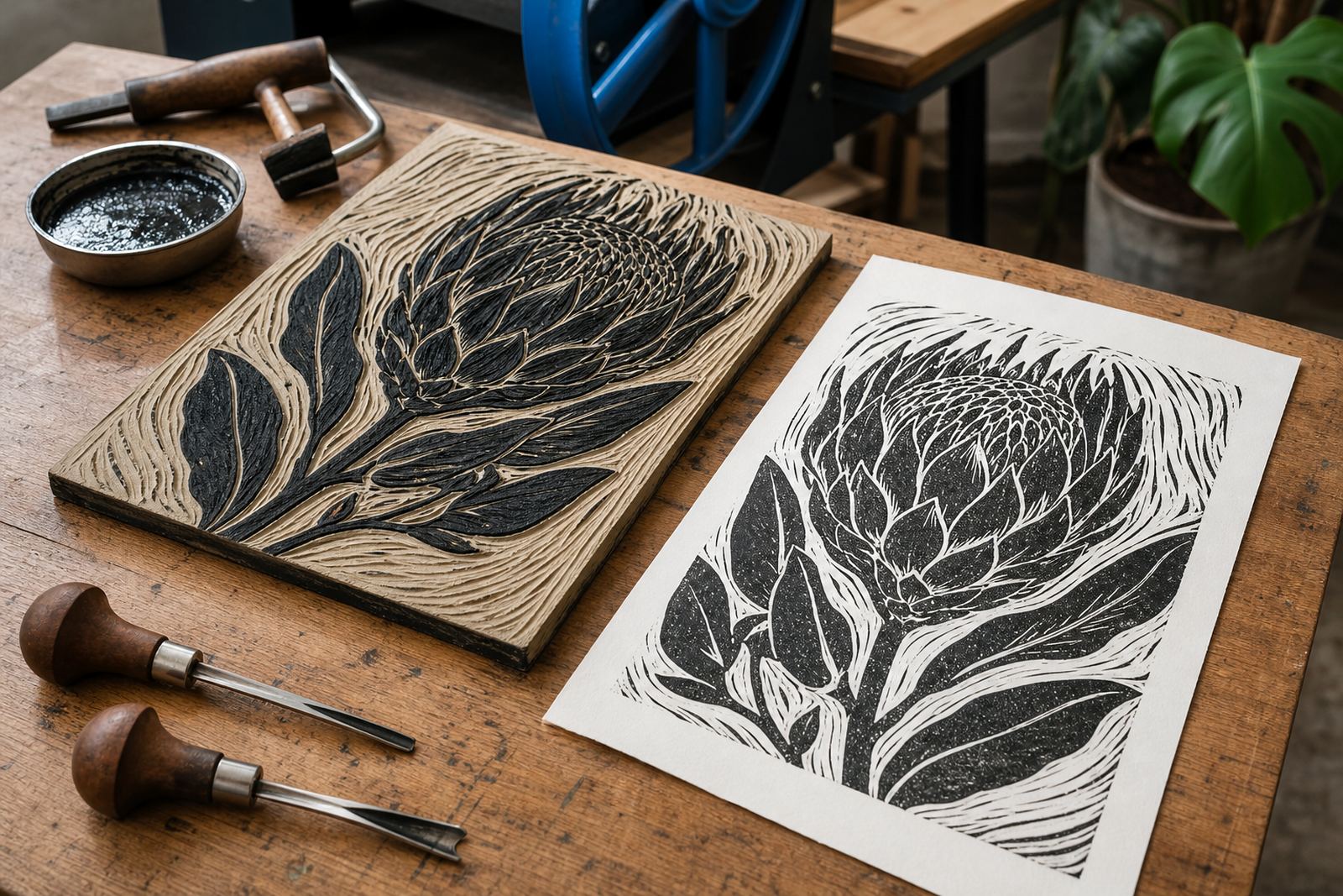
Not every block print asks for the same sheet. A freshly carved lino block with clean V-tool lines can hold detail on a smoother paper, while a soft-cut block with broader marks may suit a slightly textured surface. Water-based inks usually sit well on many workshop papers, but oil-based block inks can need a stronger sheet with a steadier surface so the impression stays even.
When the edition is small and every print needs the same look, registration becomes important too. A paper that curls badly can shift under repeated passes, which makes it harder to keep the image aligned. In a busy session, especially with beginners, paper that lies fairly flat saves time and reduces frustration.
What beginners notice first in a studio session
Most first-time printers notice pressure before they notice weight. If the paper is too thin, they may press too hard and mark the sheet. If it is too thick, they may think the ink is failing when the baren or press simply needs more even contact. So starter workshops often use paper in the mid-weight range, with enough body to handle carving practice, ink layers and repeated pulls.
- For a first edition, a paper around 140 to 220 gsm is often a practical place to start.
- For stronger hand pressure, choose a sheet that resists tearing at the edges.
- For very fine lines, test one proof before printing a full set.
- For school groups, paper should be easy to stack, label and keep in order.
Edition work asks for consistency
Once an image is being printed as an edition, every sheet needs to behave in the same way. If one page is too absorbent and another sits too tightly on the ink, the results drift. That is why edition work often uses one paper type throughout, with the same cut size and the same drying space. A mixed pile of papers may look harmless, but it can change the tone of the print from one impression to the next.
At our Woodstock studio, we see this often when people try a broad block with a heavy ink layer. A sheet that feels fine for a single art print may not be the best choice for ten or twelve impressions in a row. In Cape Town, where humidity can shift through the day, paper that stays stable and does not curl too fast is easier to handle on the board and at the drying rack.
A sensible paper choice for workshops and group printing
For family sessions, student classes and team workshops, the paper has to be forgiving. It should take a clear impression, let people see the mark they made, and survive a few hurried hands moving around the table. Mid-weight paper with a clean cut edge usually works well for that purpose. It is easier to align on the block, and it gives a satisfying result without needing too much pressure from each printer.
In larger groups, paper choice also affects the pace of the session. If the sheet curls, tears or slips, the whole table slows down. A good workshop sheet should support carving, inking, proofing and the final pull without turning the session into a rescue job. For anyone planning a school pop-up in Durban, Pretoria or Johannesburg, that balance matters even more because the work has to travel, pack neatly and print reliably in different rooms.
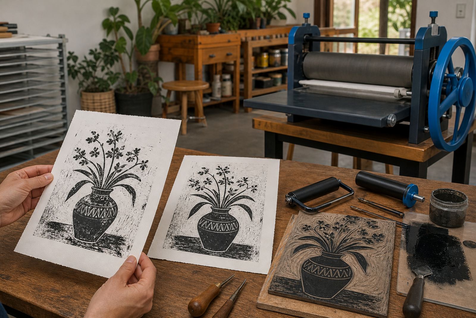
When people ask what to look for, we hand them two sheets and let them feel how each takes ink and pressure.