A classroom brief built around one colour and clear shapes
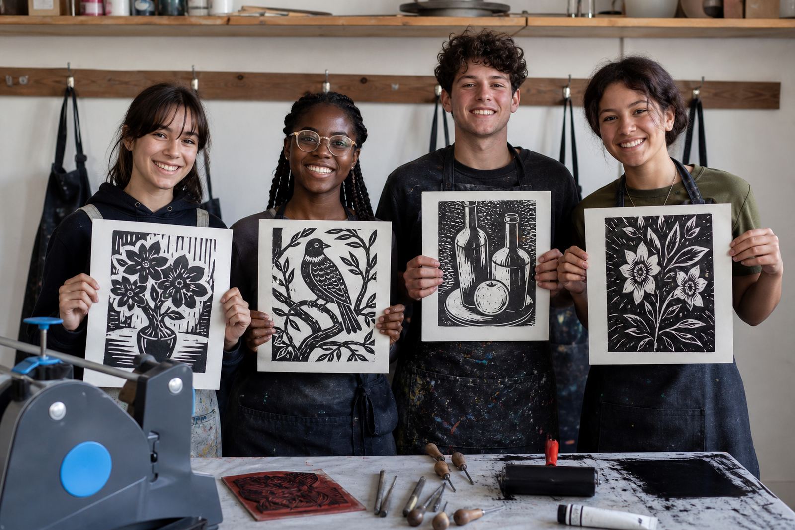
The brief came from a school in Newlands, Cape Town, with a visual arts group that wanted a hands-on print session. The teachers wanted learners to see how a simple image can change when the black line becomes a white line, and when the printed shape flips from figure to ground.
We planned the session around single-colour linocut, with enough room for younger learners to make clean marks and for older students to push the image further. The school wanted a result that stayed readable from a distance and held detail in a classroom display, so we kept the block sizes manageable and the subject matter direct.
- Project type: school art workshop
- Town: Newlands, Cape Town
- Print method: single-colour linocut
- Focus: positive and negative space
- Group mix: school learners and art staff
Materials that suited learner hands and a busy art room
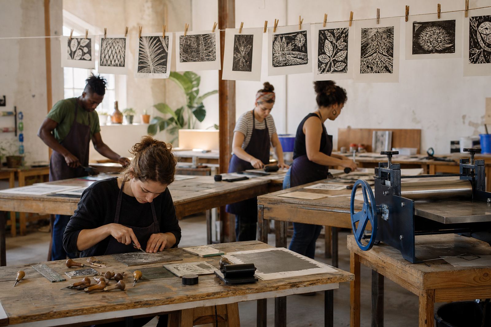
We supplied soft-cut blocks and lino-style blocks where needed, along with carving gouges and V-tools suited to controlled cutting. For a school environment, the carving stage has to stay safe and legible, so we demonstrated how to brace the block properly, how to keep fingers behind the cutting path, and how to work with short, deliberate cuts rather than long rushed passes.
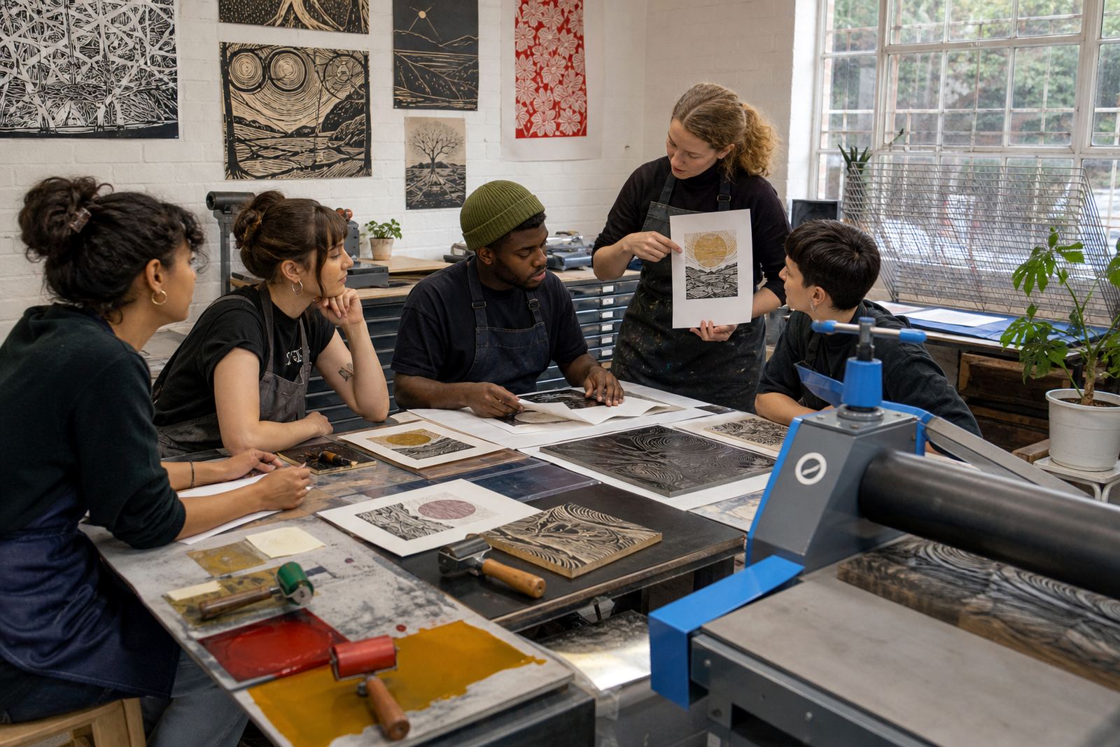
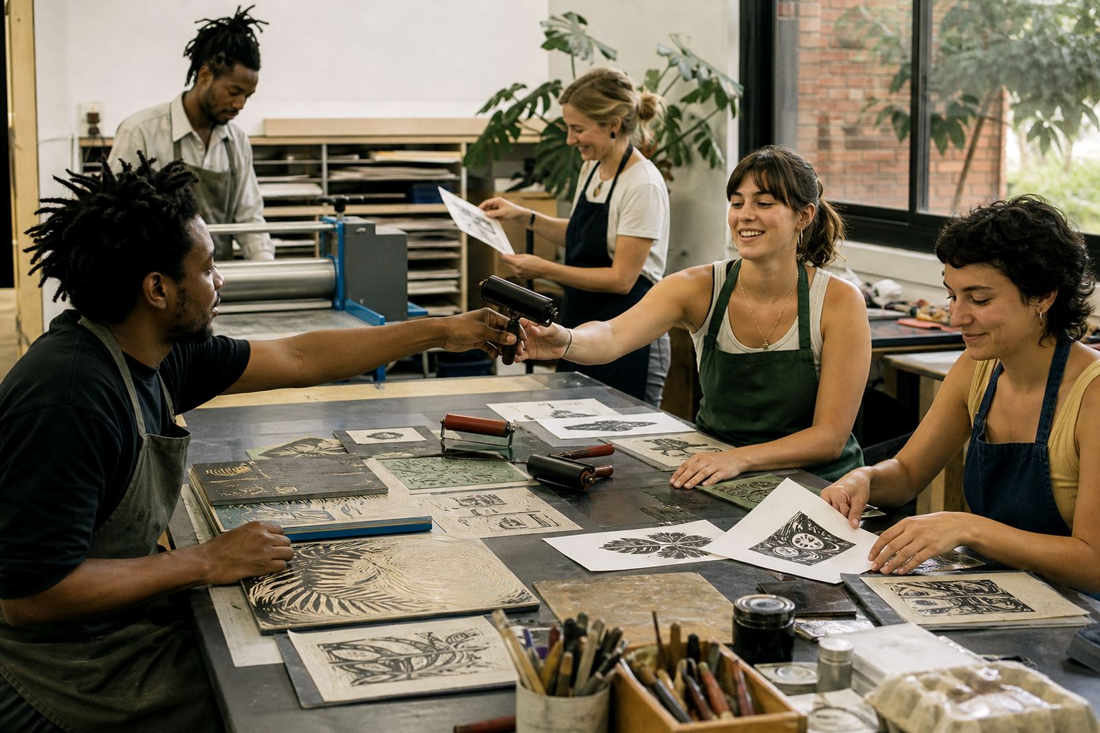
Brayers, water-based block ink and a small selection of papers were included so the class could compare the feel of different surfaces. We also showed how a baren can push a print by hand, and how a press gives a different kind of pressure and finish. That contrast helped learners see the way the pressure moves through the paper and ink.
- Carving tools: gouges and V-tools
- Printing tools: brayers, baren and press
- Ink: water-based block ink for the class session
- Papers: light and mid-weight sheets for edition tests
How the workshop was paced over three weeks
The project ran over three weeks. In the first week we introduced block safety, mark-making and a few simple shape studies. Learners sketched motifs that could hold up as high-contrast prints, then traced those into block-ready designs with enough open space to preserve clarity in the final image.
The second week focused on carving and test proofs. We checked line depth, cleaned edges where the cut had wandered, and adjusted images that needed more breathing room between shapes. The final week was for inking, registration and edition printing. Registration mattered here, because even a single-colour print needs the paper to land in the same place each time if the edition is going to look tidy on the wall.
We also left time for a short press printing demonstration, so the class could compare hand pressure with machine pressure. That helped the learners understand why an edition can look slightly different from one print to the next, even when the block stays the same.
What the learners were able to pull from the process
The strongest result was confidence. Once the class saw how a block can hold both the printed shape and the cut-away space, the work turned to thinking in reverse. Learners started to spot where a background needed to stay white, and where a cut line needed to be deeper so the final print could breathe.
The prints also gave the teachers a practical way to discuss composition. One colour is often the hardest place to start because there is nowhere for weak decisions to hide. That made the session useful for image-making and print technique.
- Clearer understanding of positive and negative space
- Better control in carving and inking
- Neater editions with more consistent pulls
- Stronger classroom discussion around contrast and form
Room for teachers, learner groups and venue changes
The school needed a format that could travel across different rooms and group sizes, so the workshop was set up to be flexible. We could work at tables in an art room, shift into a hall for larger groups, or split the class into smaller rotation stations if the timetable called for it. That mattered because school art sessions often have to fit around bells, assemblies and shared spaces.
For the Newlands project, the setup stayed compact and tidy enough for a teaching space, while still giving each learner a proper printing sequence. Papers were stacked by size, ink stations were kept separate from the carving area, and finished sheets were left to dry flat before sorting. Nothing needed a complicated layout, just a careful order to the room.
- Table-based setup for schools and studios
- Suitable for larger learner groups
- Works with hand printing or press printing
- Easy to adapt for art rooms, halls and pop-up sessions
What we would bring to another school print project
If we handled a similar brief again, we would keep the same balance of demonstration, carving time and printing time, because the class responded well to a steady pace. The strongest part of the day was the point where learners could hold a proof beside the carved block and see exactly how the cut marks became the printed image.
We would also keep the edition size modest, so the group could finish cleanly without losing attention in the last stretch. For school work, that final part matters. A tidy edition gives the learners something they can pin up with pride, and it leaves the teachers with a result that still makes sense when the room goes quiet after the session.
The Newlands project showed that a single-colour print can carry a lot of visual weight when the block is planned well and the printing is controlled from the start.
Key facts
| Client type | School art department |
|---|---|
| Town | Newlands, Cape Town |
| Workshop format | Group printmaking session |
| Main technique | Single-colour linocut |
| Tools used | Gouges, V-tools, brayers, baren and press |
| Timeline | Three weeks from first sketch to final edition |