A campus brief with clear limits
The brief came from a Johannesburg campus team working with students who needed a practical print session that fitted an academic timetable and a shared room. The class had to suit mixed experience levels, keep carving safe for beginners, and still leave room for proper print handling rather than a rushed demonstration. The core idea was to show how a single block can carry more than one colour, with each stage trimmed away as the edition builds.
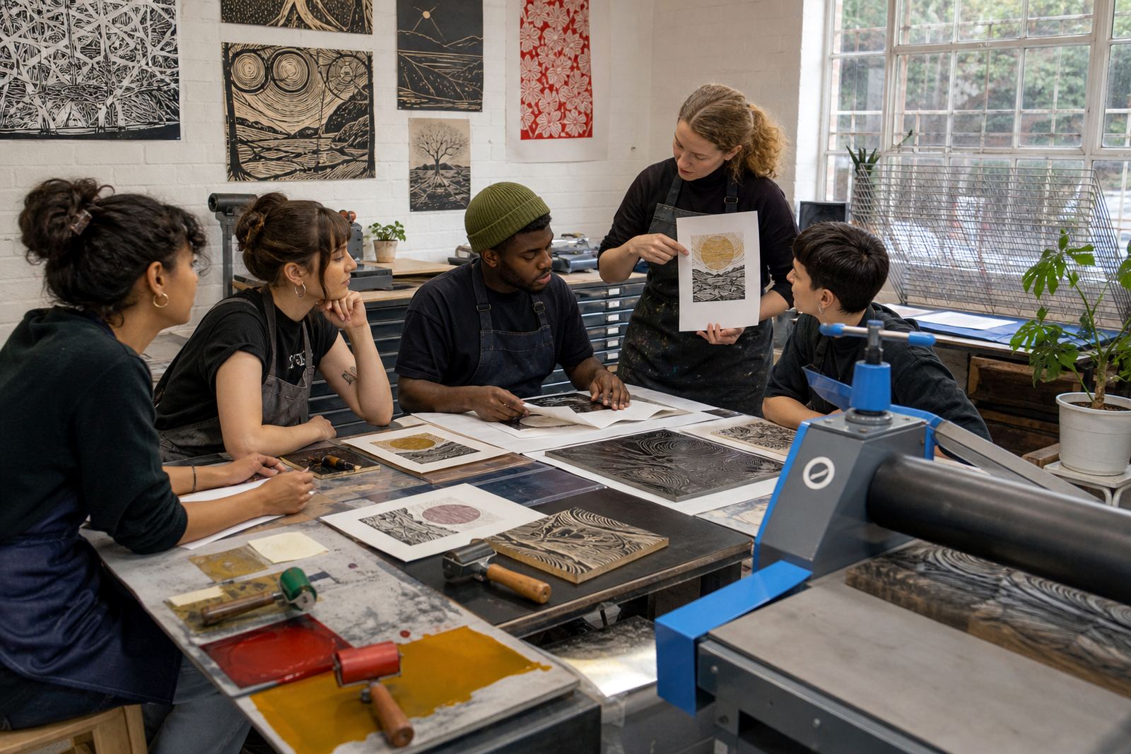
We planned the session around small groups, steady supervision and materials that could cope with table sharing. Soft-cut blocks were used for the first cuts, with lino available where harder carving was suitable. Gouges and V-tools gave the students a proper feel for line weight, corners and relief marks, while the layout kept the lesson focused on one image built in layers. That structure mattered in Johannesburg where campus classes often need to move through the work in a fixed slot and still leave students with something finished in hand.
- Client type: university campus group
- Town: Johannesburg
- Class format: layered colour linocut session
- Group mix: students with varied print experience
- Main method: reduction thinking with hand printing
What the room needed to handle
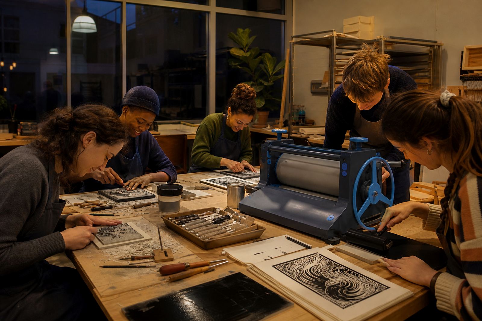
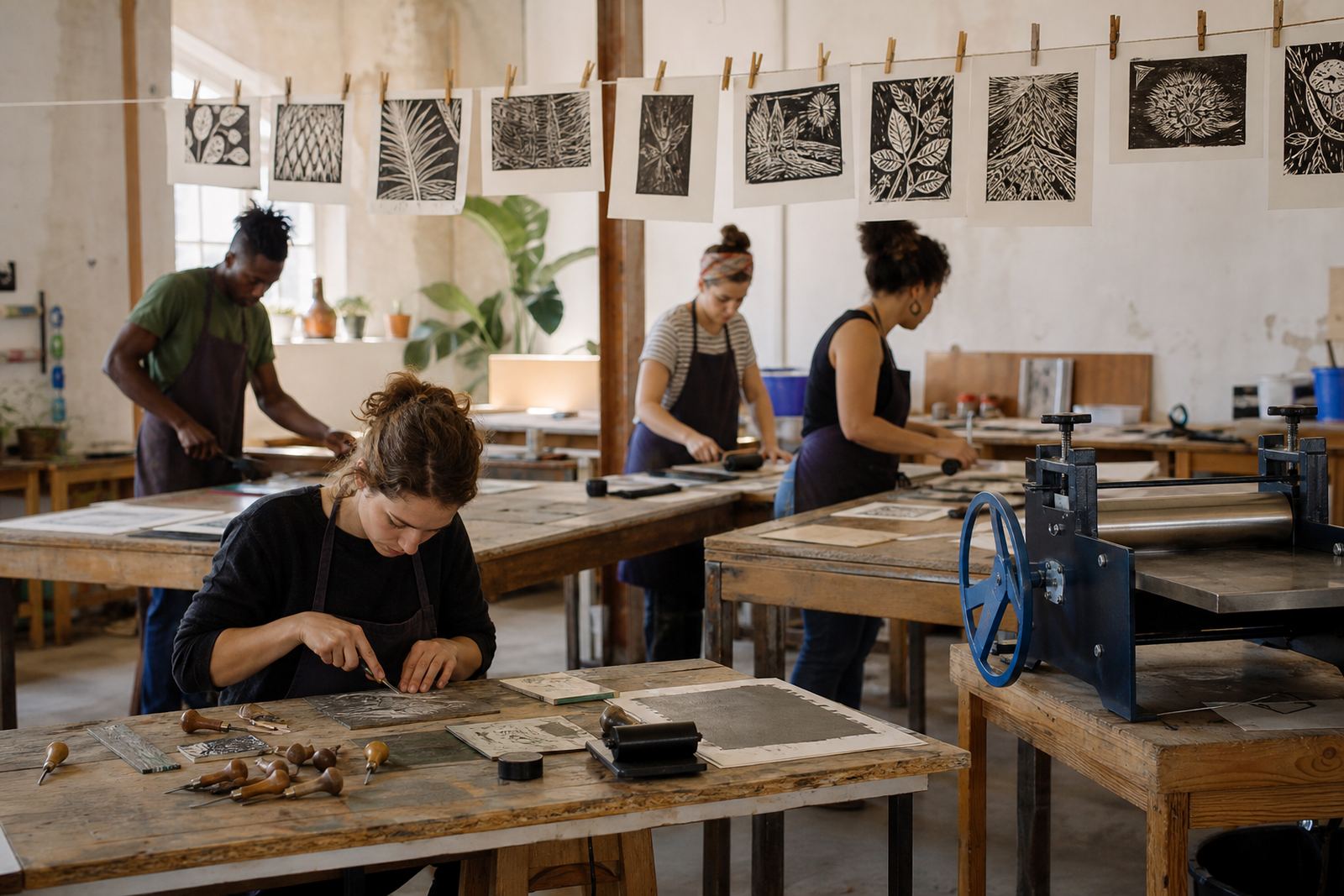
The room had to work as a print studio for the day, so we carried the parts that make a class run neatly rather than trying to improvise at the last minute. Tables were covered for cutting and inking, and the setup allowed for separate carving, proofing and final print stages. We brought brayers, water-based block inks, oil-based block inks for comparison, paper suitable for clean pulls, and the tools needed for safe cutting and registration. A baren and press printing were both used so students could see how hand pressure and machine pressure change the final result.
Safety mattered. We kept the carving direction controlled, explained how to hold the block, and showed how to work away from the blade path instead of forcing the cut. The students were also shown how to manage registration marks so each layer would sit in the same place, even where the colour blocks were being trimmed down between prints. That part of the lesson carried most of the learning, because in reduction printing the second and third layers need exact alignment.
- Tools supplied: gouges, V-tools, brayers, baren and printing press access
- Inks used: water-based and oil-based block inks
- Paper used: print papers chosen for hand and press printing
- Method shown: registration marks and reduction layering
The workshop flow from sketch to edition
We opened with short drawing choices so the group could keep to shapes that print well. Flat areas, clear edges and strong contrast work better than crowded detail when a block is being reduced layer by layer. Each student transferred a simple image to the block, then made the first cut to open the lightest parts before the first colour pass. After that came proofing, where small tests showed where the marks needed a firmer cut or a cleaner edge.
The next stage was the colour build. Students inked the block with brayers, printed the first layer, then trimmed the block further before adding the next colour. That is the point where reduction printing becomes very real: each cut removes more of the block and changes what can still be printed later. We explained editions as a set of prints taken from the same stage, with consistency checked across the pull. Some prints were finished by hand with small adjustments in pressure, others were pulled through the press for a cleaner and more even impression.
- Stage one: image selection and block transfer
- Stage two: first cut and proof print
- Stage three: colour layers and registration
- Stage four: edition pull and final finishing
How the Johannesburg group handled the process
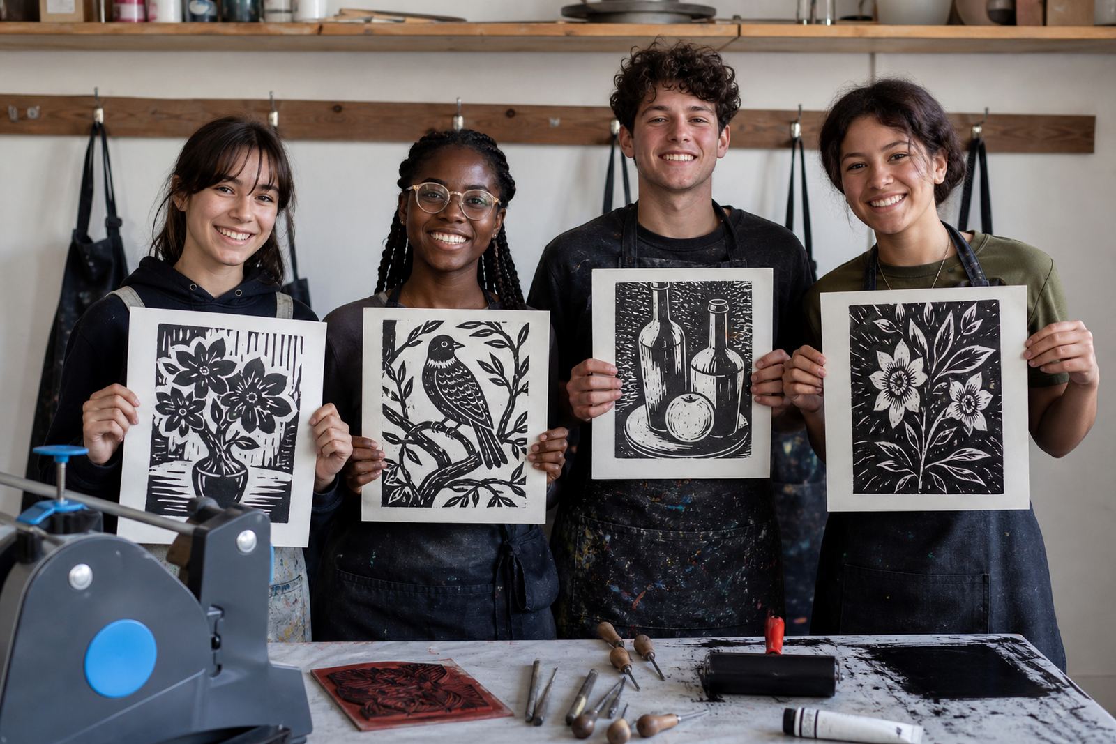
The class moved at a steady pace and the students took to the physical side of printmaking quickly. Once they understood that the block changes with every cut, the room became more careful and more deliberate. Campus students left with a print and with a method they can repeat on their own projects. The edition pulls showed a good spread of outcomes, with some prints leaning toward crisp edge work and others carrying softer relief marks from the hand pressure.
We saw the strongest results where students kept the image simple and trusted the colour layers to do the work. The pressure of the baren gave a slightly different finish from the press, which helped the group compare texture and coverage. A few students wanted more detail than the block could comfortably hold, so we steered them back to open shapes and stronger negative space. That made the final sheets cleaner and the colour relationships easier to read.
- Clear shapes printed more reliably than overworked detail
- Layered colour made the reduction process easier to understand
- Hand pressure and press pressure gave different surface marks
- Students left with a finished edition and working knowledge
Timing and material choices across the weeks
The Johannesburg class ran as a planned short course across three weeks, with each week carrying a different part of the process. The first week focused on drawing and safe carving. The second week moved into proofing, registration and the first colour layer. The final week dealt with reduction cuts, edition printing and finishing. That structure kept the pace manageable for a campus setting and gave the group time to understand what the block was doing before the final pulls.
Material choice was kept practical. Soft-cut blocks gave a friendlier first surface for students who had not used gouges before, while lino offered a firmer cut where cleaner edges were needed. Water-based inks were useful for quick studio handling and easy clean-up, while oil-based inks gave a richer body on some papers. We matched the paper to the type of pull, because a sheet that suits press printing is not always the best fit for a hand-pulled baren print.
- Week 1: sketching, transfer and carving practice
- Week 2: proofing, colour planning and registration
- Week 3: reduction cuts, edition printing and finishing
- Material split: soft-cut for beginners, lino for firmer carving
Campus print class approach to repeat
We would keep the same layered structure, because it gave the students a clear route from first cut to finished edition without crowding the room. The balance of soft-cut blocks, lino, hand tools and press access worked well for a mixed group, and the registration stage gave the clearest lesson in how edition printing holds together. We would also keep the image brief to one strong idea per block, because that keeps the reduction process readable and the final sheets more consistent.
If a similar class is run in Johannesburg again, we would keep the tables split by task and leave enough space for inking, drying and proofing. That makes the room easier to manage and reduces mix-ups between wet prints and active blocks. The session proved that students can handle proper print language when the teaching is steady and the steps are plain, and it also showed that a campus setting can support careful hand printing without turning the class into a rushed demo.
- Keep one clear image per block
- Separate carving, inking and drying stations
- Use registration marks from the start
- Leave room for proof prints before the edition pull
Key facts
| Project | Johannesburg Campus Class |
|---|---|
| Town | Johannesburg |
| Class type | Campus print workshop |
| Method | Reduction linocut with layered colour |
| Materials | Soft-cut blocks, lino, brayers, baren, press, water-based and oil-based inks |
| Timeline | 3 weeks |