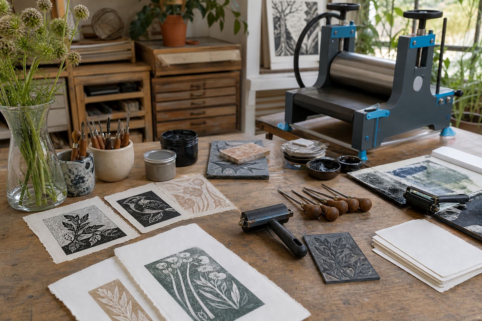
What the paper has to carry
Proofing paper can be thinner and less costly because the first aim is to check the carving, the balance of the image and the mark made by the block. For edition work, the paper needs steadier fibres, cleaner edges and enough strength to pass through repeated handling without cockling or tearing. A family workshop may use the same image on two papers and get very different results, especially where a baren or hand burnishing is used instead of a press.
As a first filter, ask three things: will the print be a proof, a classroom exercise or a finished edition; will the image carry broad flat areas or only fine cut lines; and will the sheet be used with water-based ink, oil-based ink or both. Those answers narrow the choice better than any label on the ream wrap.
Fibre content changes the feel under ink
Paper with a good mix of cotton or other long fibres often handles repeated pressure better, and it usually takes a cleaner impression in lino and soft-cut work. Wood pulp sheets can still work well for study prints, but they may show more surface disturbance when the carving is deep or the ink lay is heavy. Smooth papers can suit fine line blocks, while a slight tooth helps catch ink from textured cuts and dry surfaces.
In studio sessions we often test a small stack side by side. That makes the differences plain: one sheet may sit flat under the brayer and release cleanly, another may pick up an uneven patch where the carved area meets a solid block of colour. The paper needs to match the image.
Weight, thickness and what a press can do
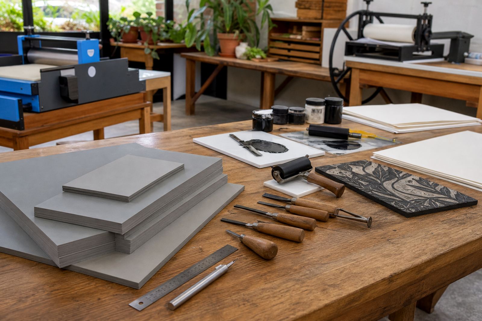
Paper weight is usually listed in grams per square metre, and that figure gives a useful first clue. Lighter sheets can be easier for beginners to handle and trim, but they need gentler inking and careful drying. Heavier papers are steadier for edition work and often stand up better to registration marks, repeated pulls and press printing.
- Use lighter sheets for proofs, practice runs and first registration checks.
- Use mid-weight sheets for hand burnishing when the image is not overfilled with ink.
- Use heavier sheets for edition sets that need cleaner edges and firmer handling.
- Test each paper with the same block, same ink layer and same pressure before committing.
A press can flatten a sheet more evenly than hand pressure, but the paper still has to absorb the ink at the right speed. Too soft and the lines blur, too stiff and the image sits on the surface with a dry, broken look.
Proof paper should show faults without hiding them
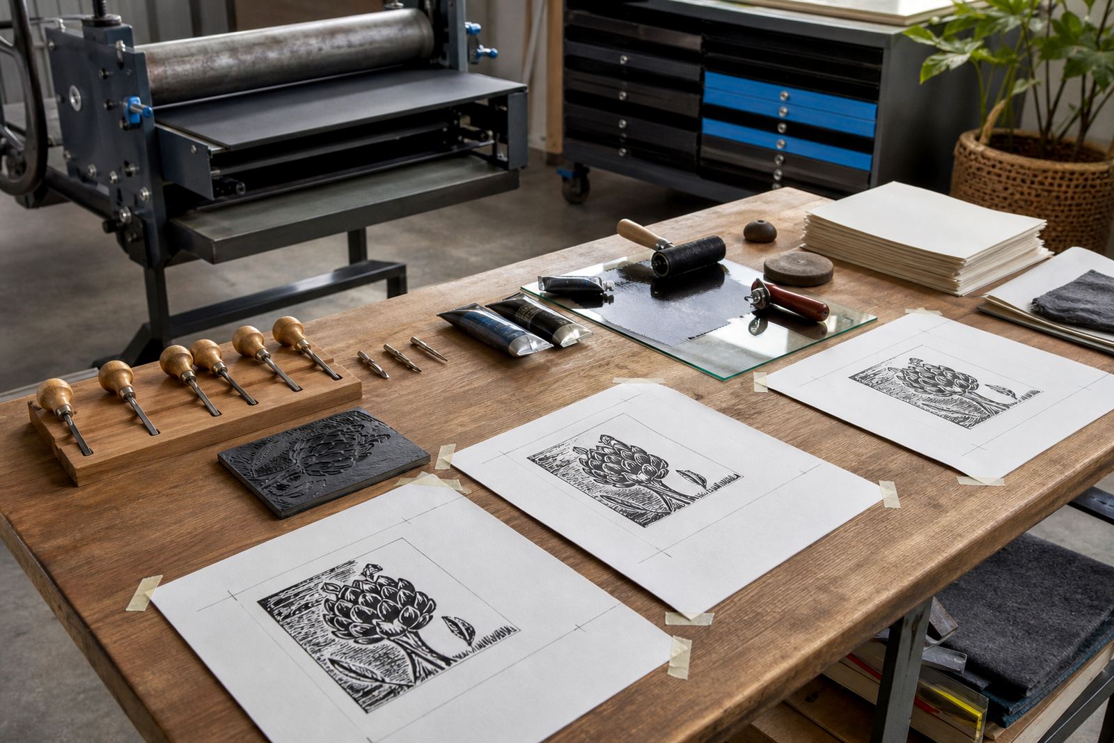
Proofing paper is there to tell the truth. It should reveal a shallow cut, a blocked corner, a dirty roller edge or a registration slip without demanding a perfect finish. White or pale sheets make those problems easy to read, though warm cream papers can help when the block has a strong black line and the proof needs a softer visual contrast.
For students, a modest proof sheet is often more useful than an expensive one. It encourages testing, correction and a second pull without worrying about waste. Keep proof paper in a dry place, because coastal humidity can change the way a sheet behaves once it has been opened and left near a studio wall.
- Choose a paper with enough body to survive several test pulls.
- Keep a separate pile for proofing, so final sheets stay clean.
- Mark the back lightly in pencil to track each trial image.
- Watch for cockling after the first pass of ink and pressure.
Hand burnishing asks for a different surface
When prints are pulled with a baren or by hand rubbing, the paper needs a surface that can take pressure evenly without scuffing. A slightly more absorbent sheet can help the ink transfer, but if it drinks in too fast the blacks may lose their sharp edge. The sweet spot is a paper that stays supple under the palm and still gives a clean release from the block.
Hand burnishing also rewards papers with enough tooth for the baren to grip. Very slick sheets can skate under pressure, while very rough sheets may pick up irregular patches from the carved channels. In a short workshop, the best test is to print a small area, inspect the corners and feel how the sheet behaved under pressure.
Edition work needs consistency from sheet to sheet
For a proper edition, every sheet should match. Sheets should be cut to the same size, stacked the same way and kept in one order so the registration stays steady throughout the run. When the paper varies too much, the ink film, drying behaviour and final colour can drift from one print to the next.
Before printing, check the grain direction if the sheet has one, then note how the paper sits under the block. A smooth feed through the press, or an even hand pull, saves time later in trimming and signing. That is especially useful for schools and team workshops, where several people may be working from the same block and the same pile of paper.
- Sort sheets by size, surface and thickness before the session starts.
- Keep your edition stack covered, so dust does not land on the face.
- Use the same paper for the whole edition where possible.
- Dry test sheets flat.
A practical paper check before the first pull
Lay the sheet on the table and look at the cut edges, the fibre feel and the way it springs back when lifted. Then make a small test mark with the chosen ink, using the same brayer pressure you intend for the full print. If the mark sits too wet or too dry, the paper is probably telling you to change something before the edition starts.
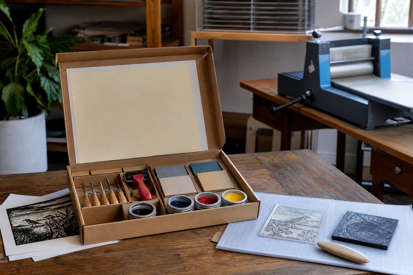
For beginner sessions, one useful habit is to keep three papers on hand: one for rough proofing, one for hand burnishing practice and one for the final run. That split keeps the lesson clear and stops the first attempt from eating into the best stock. A good sheet can make a careful block print sing.