Judge lino by how it cuts
Traditional lino sheets vary more than most beginners expect. Some sheets feel firm and even under a gouge, while others give a softer cut that suits quick marks and broad shapes. For relief printing, the sheet should let a V-tool open narrow lines cleanly and allow a gouge to remove larger areas without tearing the surface. A sheet that feels too hard can fight the tool, while one that is too soft may lose fine detail before the edition is finished.
For workshop use, look at how the sheet behaves under a first cut. The knife or gouge should travel with steady control, and the material should hold the line edge without crumbling. That matters whether you are planning a small label image, a larger poster print or a repeat pattern. In busy sessions, a sheet that cuts predictably helps keep the pace calm and the hands safer.
Thickness, backing and the way the sheet sits on the table
Sheet thickness affects both handling and printing. Thicker lino usually feels steadier on the bench and can give more confidence when carving around tight corners. Thinner sheets may sit flatter for light work, but they can flex if the board underneath is uneven. When you are printing by hand with a baren, a smooth backing board helps spread pressure more evenly across the image.
It is also worth checking whether the sheet has a backing cloth or a plain reverse side. A cloth-backed sheet often lies flatter and is less likely to curl during storage in a Cape Town studio where coastal humidity can change from week to week. Flat sheets make registration easier too, because the block stays seated in the same position on the press bed or the table.
Soft-cut or traditional lino for the image you want
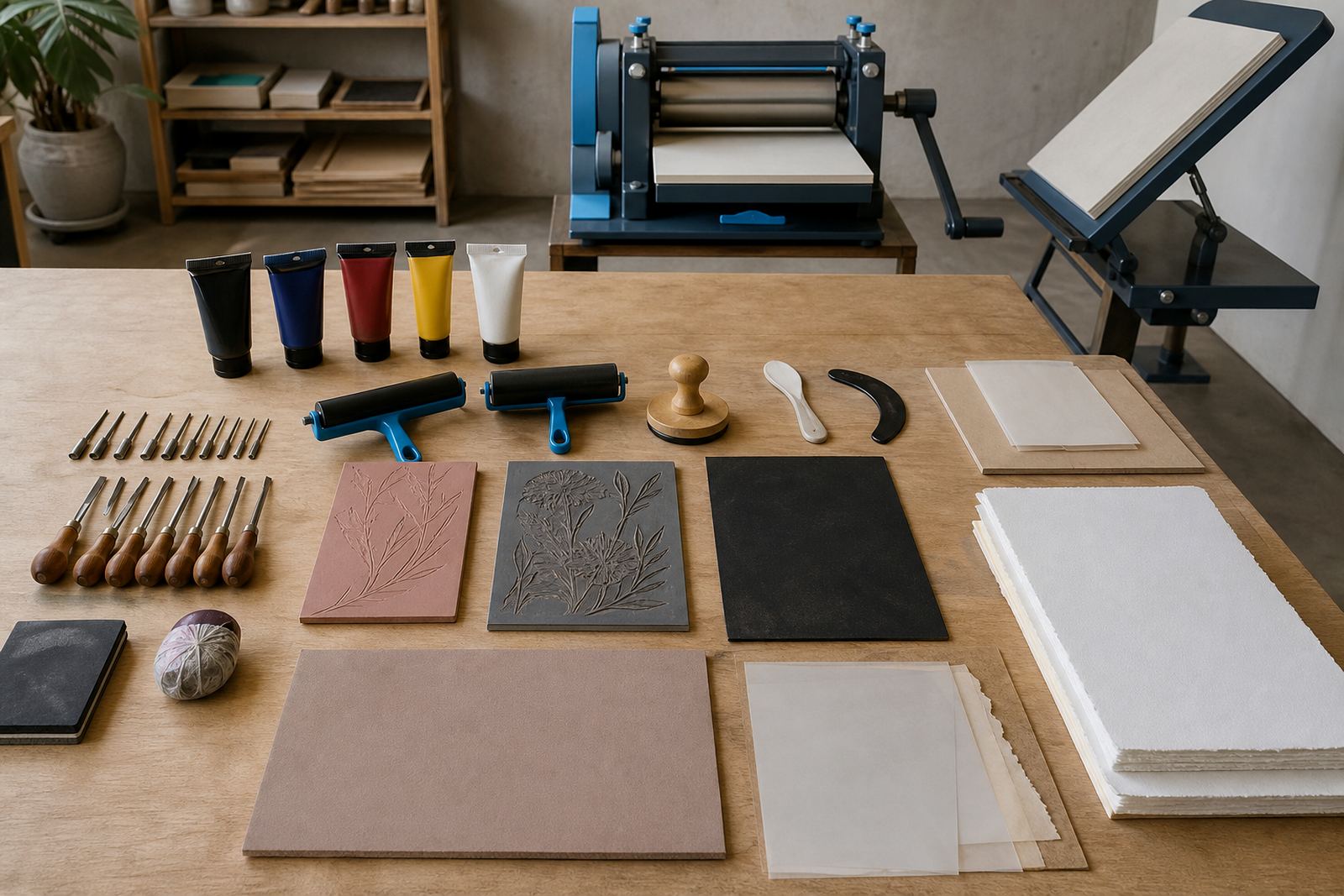
Soft-cut blocks are useful when the design leans toward broad shapes, simple outlines and quick classroom carving. They are kinder to first-time printmakers and good for family sessions where the aim is to finish an edition without too much strain. Traditional lino has a firmer bite and can be better for sharper edges, fine texture and longer studio projects.
The choice comes down to the mark you want on paper. If the image depends on crisp linework, a firmer sheet supports that language better. If the workshop calls for looser shapes and a faster rhythm, soft-cut can feel less tiring. Both can work well with water-based block inks or oil-based block inks, as long as the surface is even and the carved areas are kept clean.
Tools, safety and the first cuts into the block
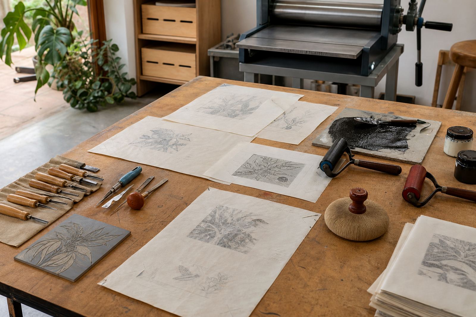
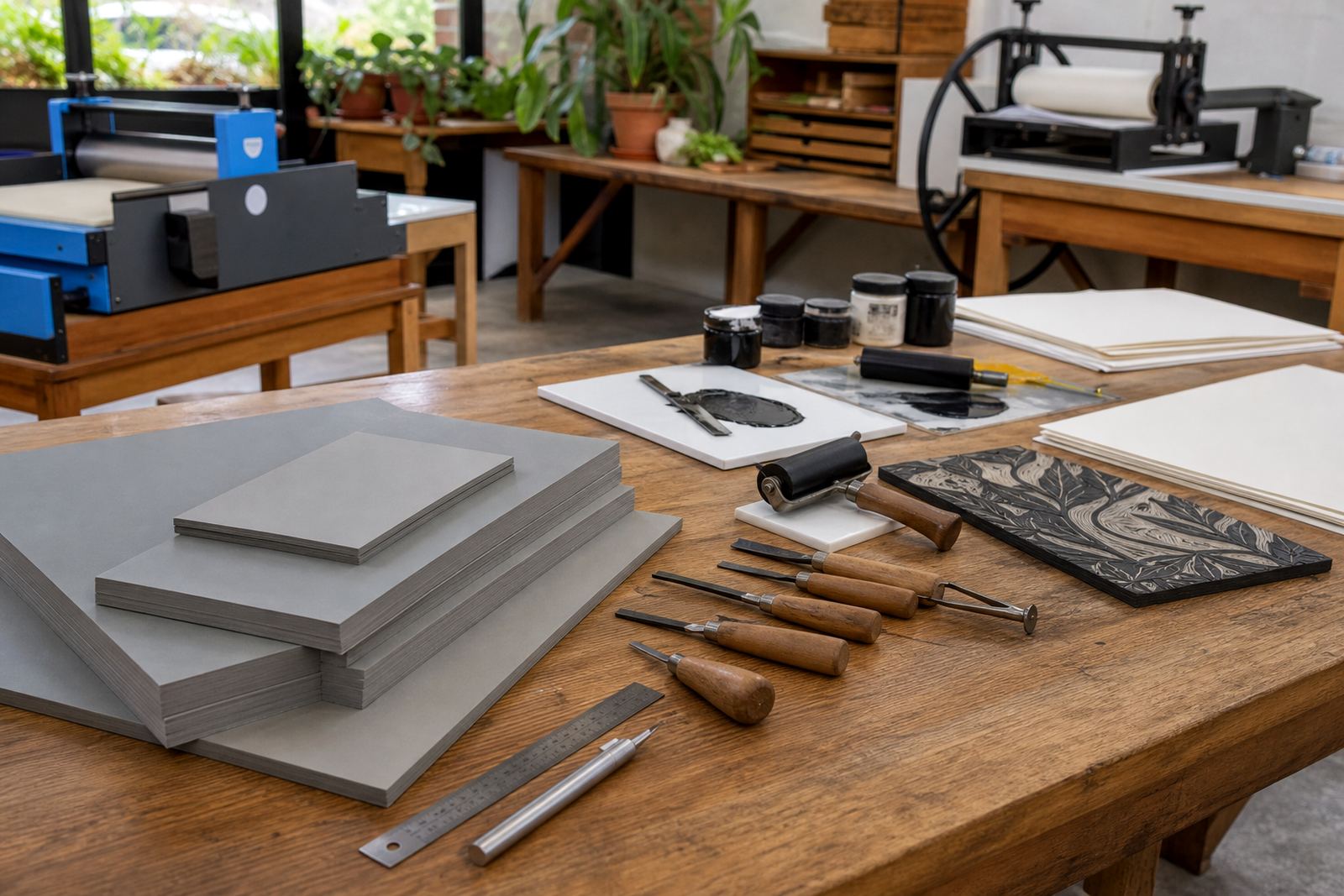
Good lino work starts with control. A sharp set of gouges and V-tools should remove material in a steady path, not in sudden bites. The block needs to be secured on a table or bench before carving begins, and the cutter should move away from the supporting hand. In school settings and beginner sessions, this part is worth teaching carefully.
- Check that the sheet lies flat before marking the design.
- Use light pencil lines so the drawing stays visible after the first cuts.
- Cut the outline first if the image needs a clear edge.
- Clear loose crumbs often so they do not scratch the surface.
- Keep fingers well away from the direction of the blade.
Blocks for children, students and adults can differ in size, and each one should be stable and easy to handle. A clean, even sheet gives the carver better feedback and makes the print much easier to read later.
Ink choice changes the whole print
Block inks behave differently on lino sheets, and that difference shows in the final paper. Water-based block inks often suit classroom work because they clean up more easily and can be rolled out quickly on a brayer. Oil-based block inks may give a richer surface and slower working time, which is useful when the edition needs careful inking and a little more open time for the press.
The sheet itself should take ink without flooding the fine cuts. If the surface is too glossy or uneven, the roller may skip across the block and leave patchy coverage. A proper brayer picks up a thin film and spreads it evenly over the raised areas. For edition printmaking, consistency matters, because each pull needs to sit close to the last one.
Registration, editions and paper that suits the block
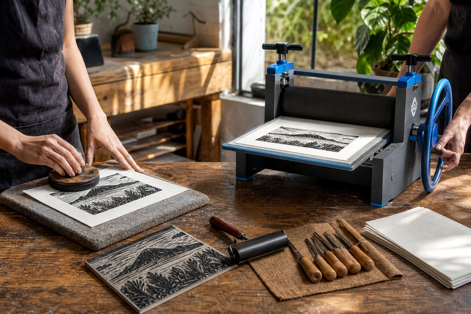
When you print more than one copy, registration becomes the test. The block must sit in the same place on the bed, and the paper should be cut or folded to a repeatable size. Good registration marks help align colour layers, especially in two-block prints or images with a second pass of ink. A press can help with pressure consistency, while a baren gives more control for smaller runs and hand-finished work.
Paper choice affects the whole edition too. Light papers can show fine detail well, but they may buckle if too much ink or pressure is used. Heavier papers can take a firmer pull and suit press printing, though they still need to sit cleanly against the block. For students working in Johannesburg, Pretoria or Durban, paper should also be stored flat and dry, because curled sheets make alignment harder and can disturb the print edge.
Lino sheet checks before you order
Choosing lino is easier when you test the block against the job in front of you. A workshop print, a school activity and a finished edition each ask for a slightly different surface. Keep the following points close while you compare sheets:
- Does the sheet cut cleanly with your gouge and V-tool?
- Will it hold fine linework without breaking away?
- Is the surface flat enough for even inking?
- Does the thickness suit hand printing or press printing?
- Will the block stay stable during registration?
- Does the material match the level of the carver?
If the answer is yes to most of these, the sheet is probably a sound match for the print you have in mind. A good lino block should support the image without arguing with the tools. That is what keeps the process calm, readable and useful in a real studio session.